These guys are absolute rock stars. Wouldn’t waste time researching any other web designers. They’re able to handle not only the design functionality of the website, but the usability from a user standpoint, which is most important. What they designed far exceeded what I had ever imagined.

Justin Thomas
Chief Operations Officer, Orbit MedicalClean, Simple Design.
CueCamp was approached to rebrand Orbit Medical. Their former, outdated medical website was difficult to use and too complicated. The new site needed to be simple with easy-to-find information, products to purchase (e-commerce) and improved customer support. Their return-on-investment has been huge, with the redesign paying for itself many times over.
Besides building a beautiful new website, branding adjustments were completed to reduce the dominant red colors that had been overused. Following color psychology guidelines, CueCamp introduced medical blue branding on the website to correctly express an identity in-line with the medical industry.

Clear Calls-to-Action.
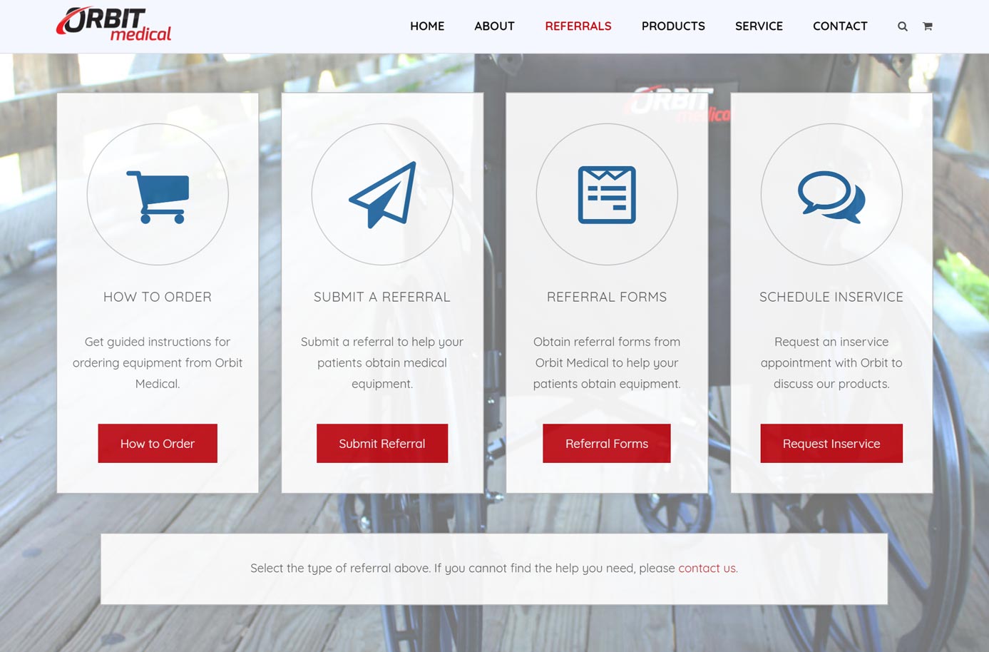
Customers can request service without having to pick up the phone. Partners can request an in-service or refer a patient. Customer service representatives can answer questions and fill orders electronically.
The services now available on Orbit Medical’s website have not only increased operational efficiency, but have also raised client satisfaction. Many manual procedures have been automated on the new website, which has driven down customer support costs.

Recategorized, Easy-to-Find Products.
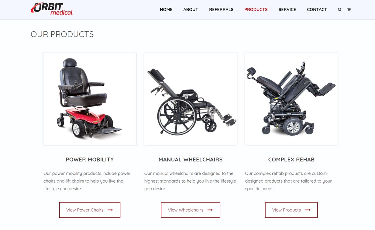
The new Orbit Medical website streamlined the product categories, and condensed the total number of products offered on the website. In turn, users quickly gain a better understanding of the types of products sold by Orbit Medical. Branding and identity are also positively affected.
Besides e-commerce and online sales, some products are available via an online insurance application. Accordingly, this feature integrates digitally on supported product pages.

A Lead Generation Machine.
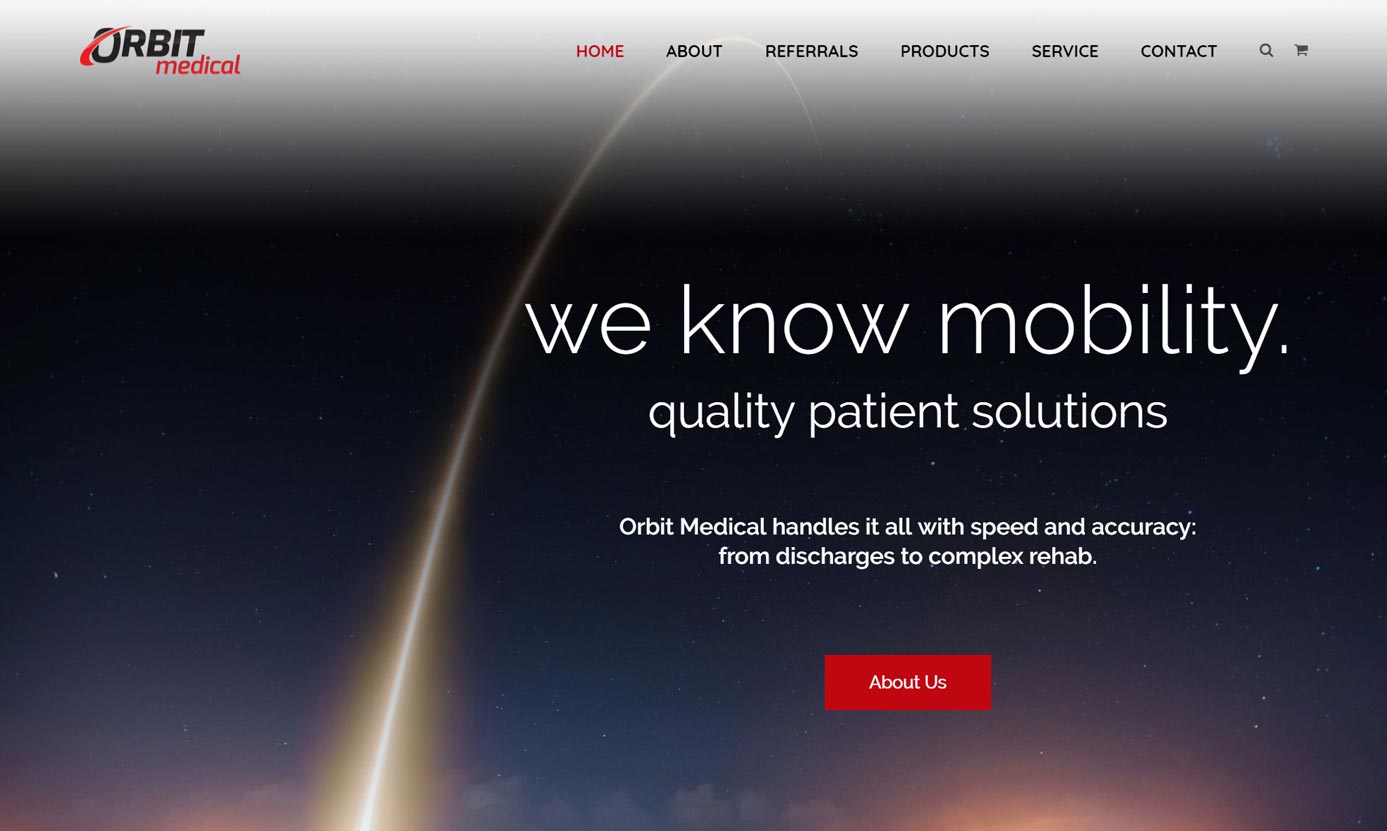
Orbit Medical is one of the largest durable medical equipment providers in the Midwest: providing things like rehabilitation equipment and power chairs to medical patients. CueCamp completely redesigned Orbit Medical’s web presence by simplifying the website structure, rewriting content, and creating a new look and feel that better suited their industry.
Strategic Rebranding using color psychology
E-commerce (WooCommerce) platform
Responsive Design (Looks great across desktop, tablet and mobile devices)
Simple Forms, Higher Lead Capture

Reduced Annual Customer Support Costs by $60k.
Throughout the company, improved workflows use technology empowered by the new website. Customers, partners, and employees of Orbit Medical can utilize information and interactivity provided by the new website to fulfill their needs.
Orders generated online are now automatically entered into Orbit’s software for fulfillment.
Insurance Order Integration
Automatic Entry of Patient Data
Lowered Customer Support Costs
Capture website leads by better appealing to their interests.


Operational Efficiency, Achieved.
Orbit Medical’s old website had thousands of products that customers were not buying because they were too hard to find. Primarily, Orbit’s customers would buy through insurance using a customer service representative. Orbit’s new website was redesigned to reflect this process, while simplifying the brand message and product categories to boost sales and lower customer support costs.
Ready to boost engagement and build a medical website that’ll generate growth?
CueCamp loves business, and would love to learn about yours. Let’s talk strategy and figure out how to craft a unique brand message that’ll generate explosive business growth.

Reach out to the CueCamp team

Design a Custom Marketing Strategy


