A user-centric website is one that has the needs of the user in mind. However, user experience / UX strategies don’t have to be complex. There are some basic elements you can deploy that will help your users have a positive experience interacting with your company’s online presence.
With 1.3 billion websites on the internet, there is competition aplenty in nearly every industry. If your site doesn’t provide the best experience, users will simply find another. A user-centered design is going to be highly usable. Everything will function perfectly and without error. Here are nine simple things you can focus on to create a usable site:
1. Get Right to the Point
If you have targeted the right audience, they are already interested in your service or product when they land on your page. Instead of adding in unrelated things, simply get to the point. People are quite busy and don’t have time to wade through a lot of information to get to what they want. Add prominent call to action (CTA) buttons that are easy for the consumer to find.
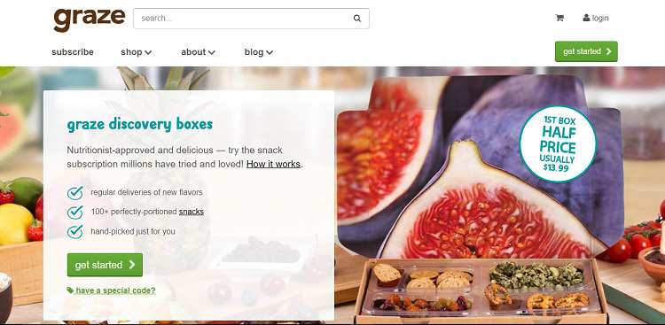
Note how Grace gets right to the point about why you’ve come to their site. They give a quick explanation of how their box subscription kits work and offer a CTA in green that says, “Get Started.” They also offer half-off your first box to entice you a bit further.
2. Visible Navigation Structure
Your navigation structure is the backbone of your website. It guides the user through your pages almost from the first minute they arrive. Among visitors referred to your website, on average, 50 percent of them will use the site’s navigation to get themselves oriented. But navigation isn’t simply your nav bar across the top of your page — it’s also the sales funnel you guide the user through from the landing page, plus minor details such as linking your logo to the home page to serve as a breadcrumb for visitors to find their way back to start.
3. Actionable CTAs
Your call to action invites your site visitor to take a specific action and to convert from simple site visitor to subscriber or customer. A lot of factors come into play when creating the perfect CTA. The language you use, the color of the button and even page placement can make a difference. You also aren’t limited to a single CTA on a page, but you do need to make sure each one has a clear direction.
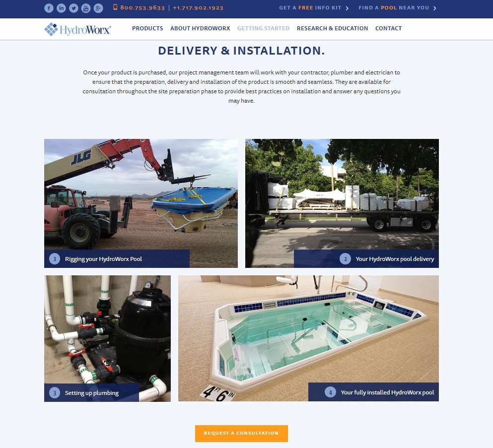
HydroWorx offers very clear CTAs on their landing page so site visitors know exactly what action to take and when. The CTAs are a bright orange, which stands out against the white background and complementary dark blue design. The placement is smart because it lines up with each section and helps answer questions the user might have. The wording is clear and includes, “Request a consultation,” “Estimate profit” and “Get a profitability analysis.”
4. Instant Feedback
Have you ever filled out a contact form, hit submit and then weren’t sure if it was sent to the company or not? This is very frustrating for users. Site visitors should receive feedback for any action they take. If the visitor clicks on a submit button, a message should pop up that the form has been received and what the visitor can expect next. Look at the different actions a visitor can take on your site and make sure each one has a response appropriate to that action, such as loading a new page that says, “Welcome!” or “Thank you for us.”
5. Customer Service
The way your company interacts with site visitors has an impact on their overall experience. Do you have a customer service philosophy in place? Is it effective? Around 86 percent of consumers say they will pay more for a product if the overall customer experience is better.
Even though the entire customer experience is about more than just service, the way you handle complaints and questions plays a big role in the overall impression the customer has of your brand. Take the time to get a customer service philosophy in place.
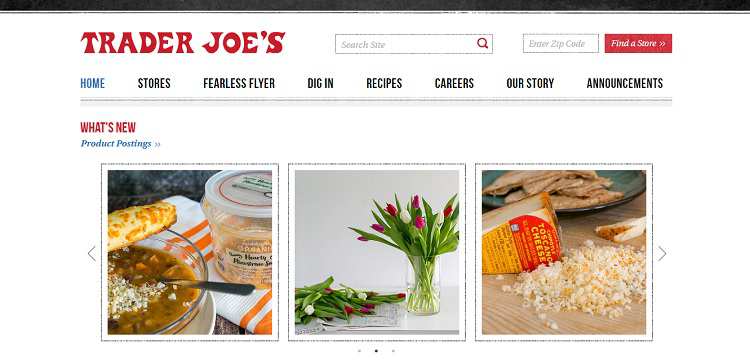
Trader Joe’s has a reputation for excellent customer service. Walk into any brick-and-mortar store and you’ll be treated like royalty. One example of them going above and beyond for a customer was reported on Reddit. In this example, the company went out of their way to deliver food to an elderly man who was snowed-in. Not only did they deliver the food, but they also gave him the food for free. That’s a brand that cares about their customers.
6. Use Heatmaps
Figure out which areas of your site are most attractive to your site visitors and limit choices to those main links. You can, of course, add other elements within the overall structure of your site, but when it comes to where to focus, you want the main elements people are looking for to be front and center. You may also want to move these sections higher up on your landing page so visitors can find them quickly.
7. Offer Valuable Information
One way you can engage users is by educating them on what you sell. The person may or may not have tried your product before, so offering in-depth information allows the user to make an informed decision about whether or not they want to try your product. You can offer this information in the form of guides, articles or a comparison chart. Try offering it in a variety of ways, remembering that visuals are well received by site visitors. You can even conduct some split testing to see which elements work the best for conversions.
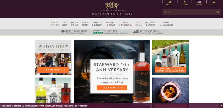
The Whiskey Exchange does a good job of educating their site visitors. They offer different topics the user might be interested in along with a CTA to “Learn More.” The topics rotate from time to time, so those who visit the site regularly can still learn new things. For example, some topics featured include popular products from New Zealand and winter drinks.
8. Social Media Integration
Some of us have multiple social media accounts, but 81 percent of Americans have one at least. The public loves social media because it’s an easy platform to grab information and then share it. There are several ways your site can integrate with social media. Allowing users to share photos and blog posts is one simple way. However, you can also add apps that allow a user to log into your site with Facebook, Twitter or Instagram. Start with the basics of allowing users to share your information and then see what else might be viable.
9. Integrating Video
The statistics on using video in your online marketing is something you can’t ignore — 87 percent of those who market for a living use online video content to drive conversions. Video is a way to get your message across in a way that sticks with the consumer. Videos add information to your website for the user who prefers to watch a video rather than read text or even an infographic.
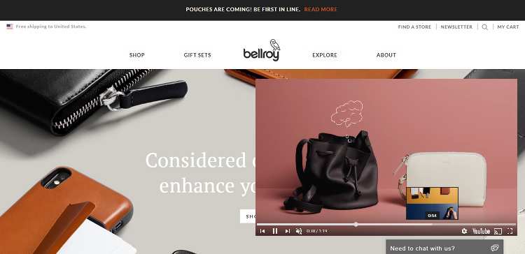
Bellroy uses a video that highlights some of their products and what they do. If the shopper doesn’t want to read through descriptions, they can view the video and learn a little more quite easily. On the Bellroy site, the video is located under the header, but for the purpose of this case study, we’ve moved the video up so you can see it easily.
Last Thoughts
UX strategies shouldn’t be one of the last things you implement on your site — it should be the first. This will help you avoid frustration on the part of site visitors and retain more of the traffic you drive to your page. Take the time to conduct A/B testing to see which elements work best with your target audience. You should also go through your site step-by-step as though you are a first-time visitor and look for possible issues.
Written by: Lexie Lu, Design Roast (via Website Magazine)
Posted by: CueCamp


B Zhou
These are very useful tips! Integrating videos on your site can really make a big difference, right? Actually, all the key points mentioned here!