There is a reason you are not familiar with many -maybe not even one- of Airbnb’s competitors. The renting/booking marketplace “giant” has thrived in the global market for a decade and still hasn’t found anyone that can stand up to him.
A considerable amount of that success derives from the ongoing effort of Airbnb’s design team to create a user experience for its booking platform which surpasses that of other similar services.
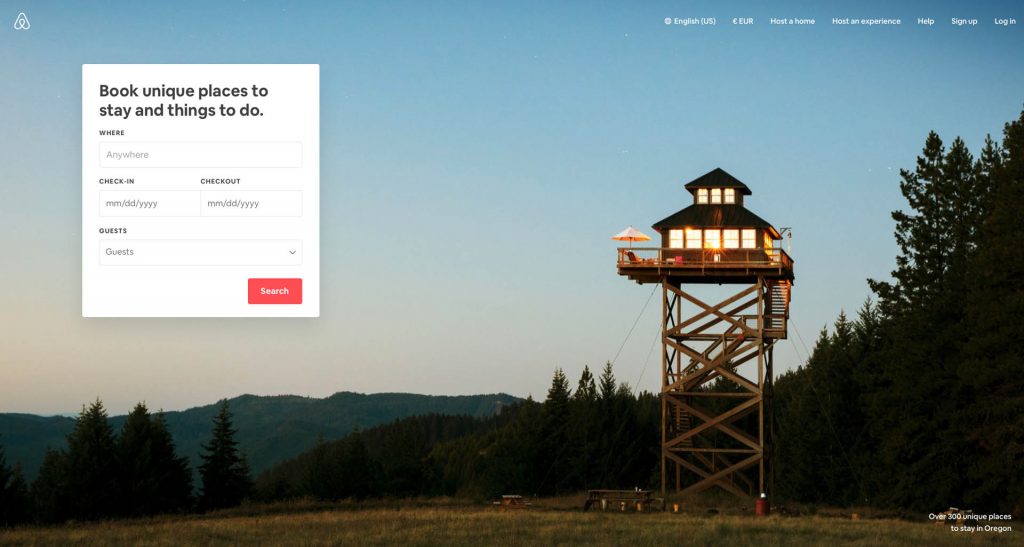
Airbnb’s Landing Page design (above the fold) as I am typing this
As a designer, I was always astonished of how Airbnb approaches their product design challenges and delivers a product that converts, for years now. So in this article, I’ll try to identify what makes their landing page design different and why it is successful.
Visual Clarity and Minimalism
I strive for two things in design: simplicity and clarity. Great design is born of those things.” — Lindon Leader
Using colour contrast and shadows, the user interface is basically structured as two layers: The card, which contains the explanatory text and the Call-to-Action (CTA) button, forms the upper layer, while the rest of the page is perceived as the background layer.
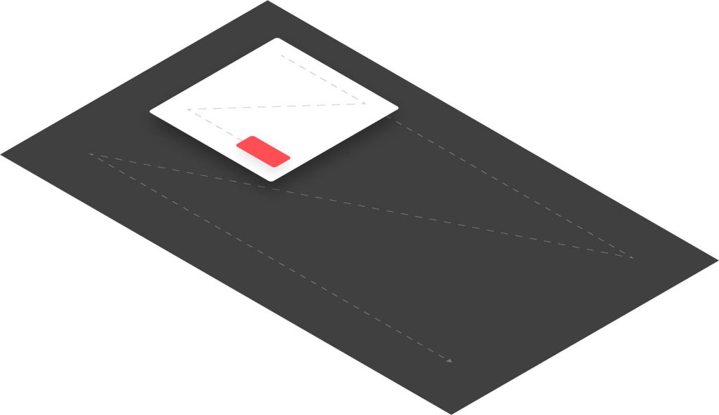
Perceived layers of user interface
With little to no cognitive effort, users can identify the upper layer (card) as the area with which they can interact. The page as a whole does not overload the users with information, hence framing a clear interaction path for users who land on it.
Reducing the cognitive load the user needs for achieving his goals is of the utmost importance when designing for humans.
Let’s see how it compares to Booking’s landing page design, in terms of visual clarity, by using predictive technology:
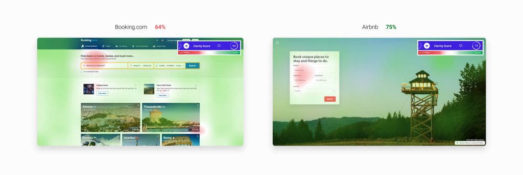
Measuring optical clarity of the landing pages (above the fold) for Booking.com and Airbnb via VisualEyes plugin
More clarity contributes to easier and driven scanning of information. Two metrics that can determine how an interface is efficiently designed for human interaction is Visual Complexity and Prototypicality. The conjunction of those two metrics affects the aesthetics processing of the user significantly and, thus, defines how he will interact with the interface.
More complexity requires more cognitive load. More cognitive load means less user engagement and, sequentially, less conversion and profitability.
Key Takeaway:
Airbnb has set an interaction focal point; therefore users have already determined where they will have to “lay their eyes” in order to forage information.
The Double Z-Pattern
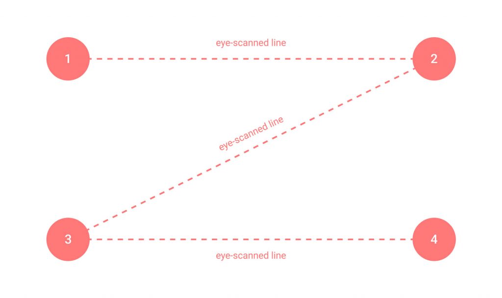
The Z-Pattern (for people that read from left to right)
Humans have a natural reading pattern, which is applied when visual stimuli are present. Following the natural flow of eye-scanning a layout, the Z-Pattern complements better single-purpose webpages that contain only one CTA.
This specific pattern “traces” eye movement of the users, thus allowing for strategic placement of visual elements.
So, Airbnb used the Z-Pattern.
Twice.
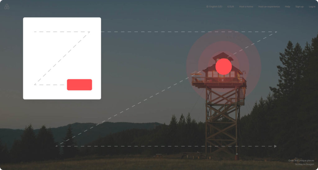
Airbnb is setting focal points for their users, using the Z-Pattern
By utilising this layout, Airbnb’s designers achieved to establish a concise visual hierarchy. Areas of interest that convey some kind of message are pinpointed and brought up to the user’s attention. Below you can view how Airbnb’s Z-layout translates into attention heatmaps:
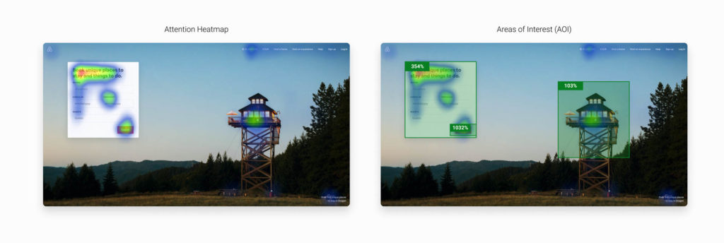
Attention Heatmaps generated in Figma, using the VisualEyes plugin.
Attention heatmaps suggest that the selected areas are drawing the most of the user’s attention in this particular instance.
As it is shown on the right image, the Area of Interest, in which the Card is placed, stands out three times more than the focal point of the hero image, while the CTA Button on the bottom right of the white card is almost three times more prominent than the card itself.
Key Takeaway
Airbnb augments, even more, the pre-established interaction path, by driving most of the attention to the single action -clicking the button- needed in order to “dive deeper” into their product.
Read more on the Z-Pattern here.
Priming
“Priming is a technique whereby exposure to one stimulus influences a response to a subsequent stimulus, without conscious guidance or intention.”
In other words, priming takes place when taking one’s memories or mental associations and using them to influence his future behaviour towards an upcoming matter.

The first image (Hero) someone views when interacting with Airbnb’s website
Almost all websites/products apply the “priming” effect to their audience in some way. In our case, the Airbnb landing page design, visitors are subject to associative priming with the use of imagery. The design team is doing an excellent job in finding images that fit the company’s target group perfectly, so they can ensure that the desired emotions will be triggered.
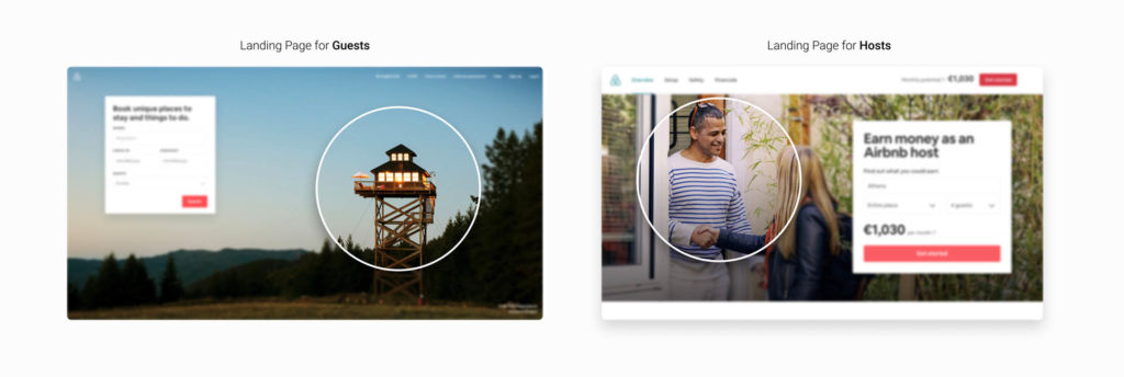
Different target audiences, different hero images.
Which words pop in your mind when viewing the house on the left image? Maybe something like soothing, peaceful, refreshing, unique, care-free or even vacation-material?
Key Takeaway:
By “priming” their target audience, Airbnb’s designers use carefully-picked images to spark the emotions that could be associated with the subsequent expected experience: Staying in an awesome place for their vacation.
Read more on Priming from NN/g here.
Simple, strong and effective language
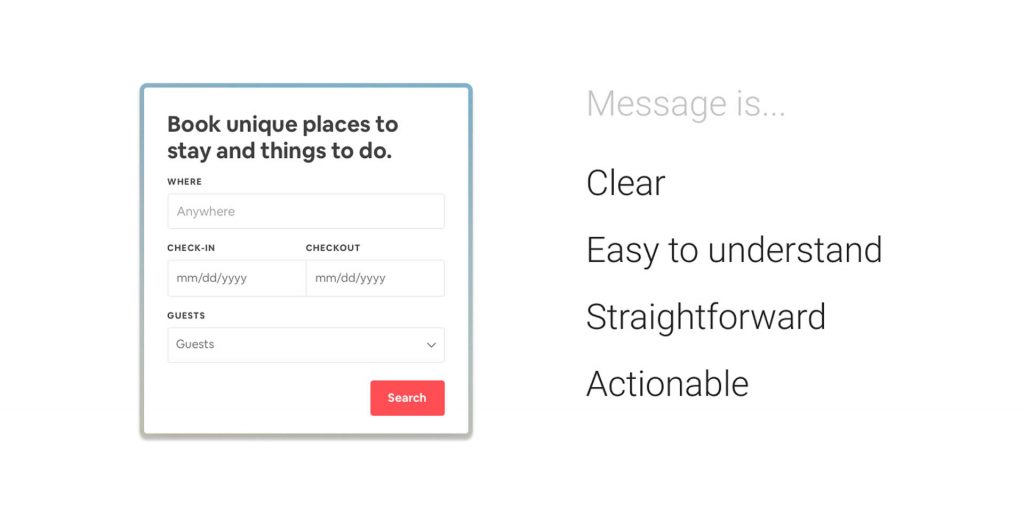
The text serves two purposes:
- Validate the reason a user visited the website in the first place — “I’m where I was supposed to.”
- Set a user goal — “Now I should search for places I want to visit.”
Using simple and clear language when communicating messages is essential in web design, as it establishes that your audience will not misinterpret your offering. Remember that communication is a “two-way street”:
“How well we communicate is determined not by how well we say things, but how well we are understood.” — Andrew Grove
Airbnb avoids unnecessary jargon, while choosing a set of words that their target audience will comfortably understand.
Key Takeaway:
Text content was carefully selected to disclose a specific message and the value of the product as quickly as possible, with few words in the play. All that without endangering that their audience will not understand the offering.
Conclusion
Insightful design is human-oriented and drives human actions and emotions. Airbnb’s design team found a very subtle -almost transparent- way to direct users’ actions on their website. The framing of the experience was so delicately designed that it accelerates interaction while keeping the primary user goal in mind.
Thanks for tuning in!
Written by: Thanos Dimitriou (via Medium)
Posted by: CueCamp


