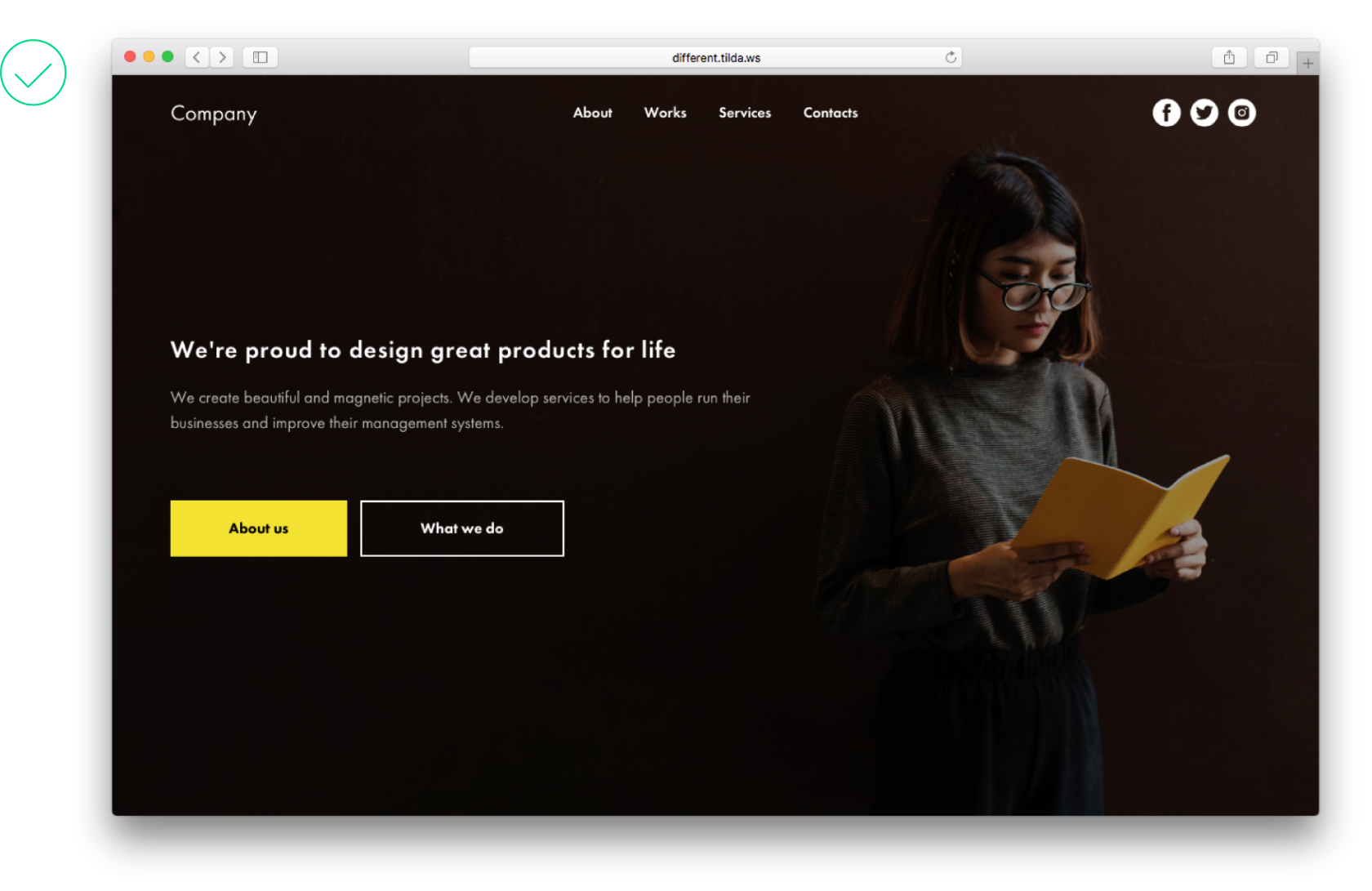
Simple layout and design element tips to help you create a stunning webpage.
Common landing page design element mistakes to avoid
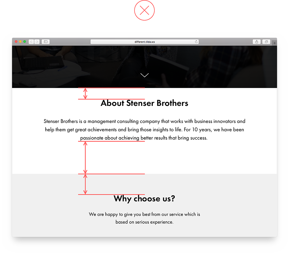
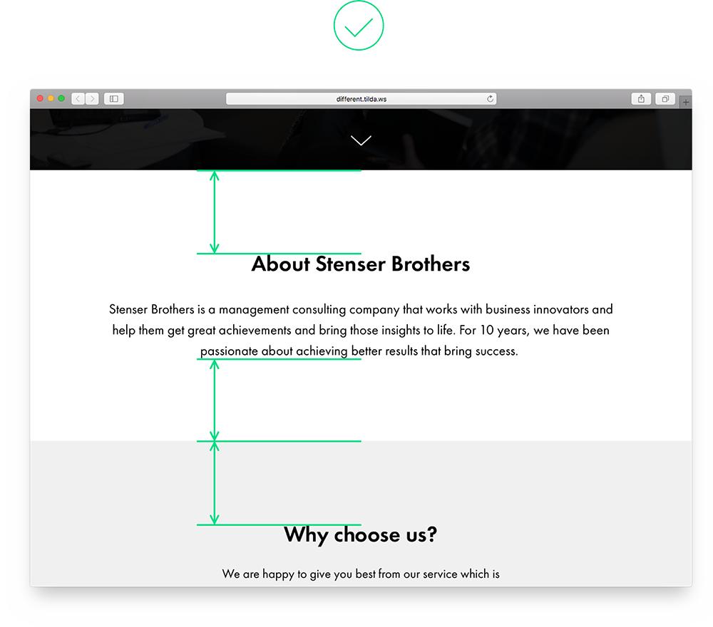
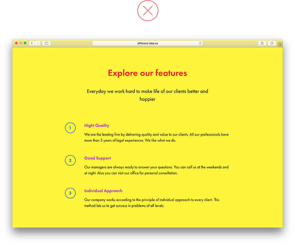
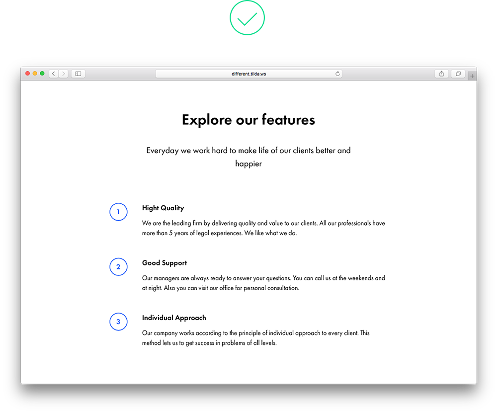
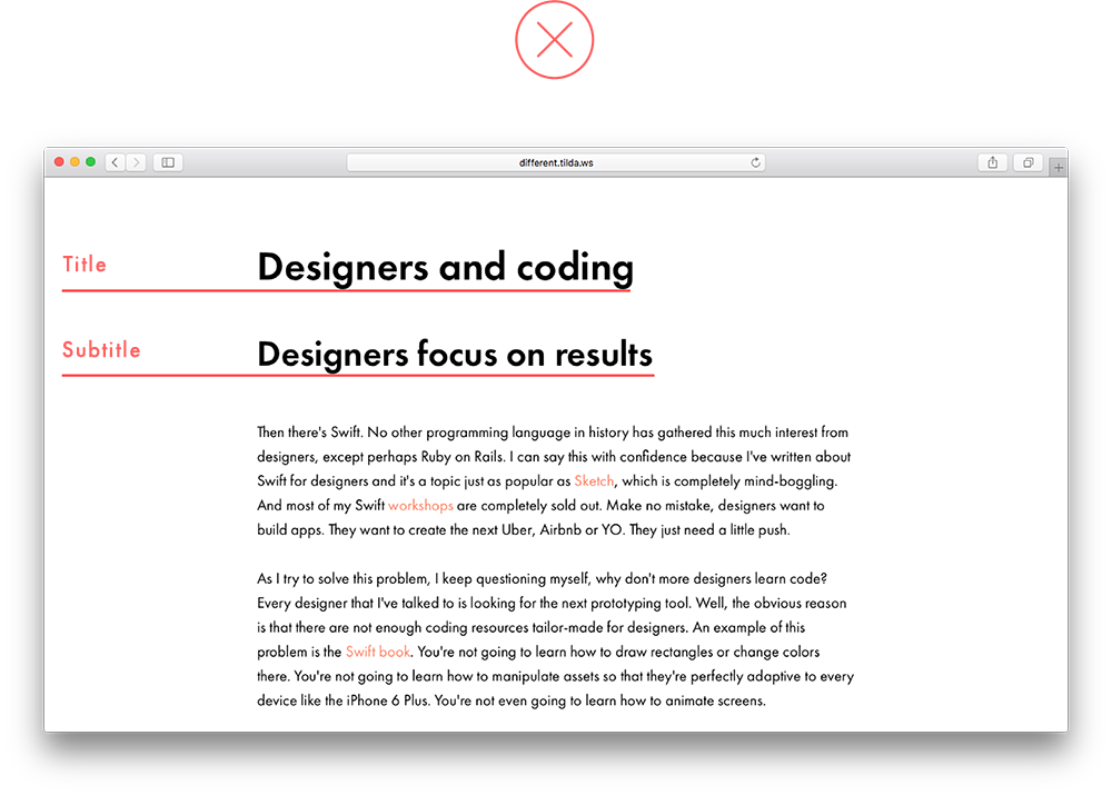
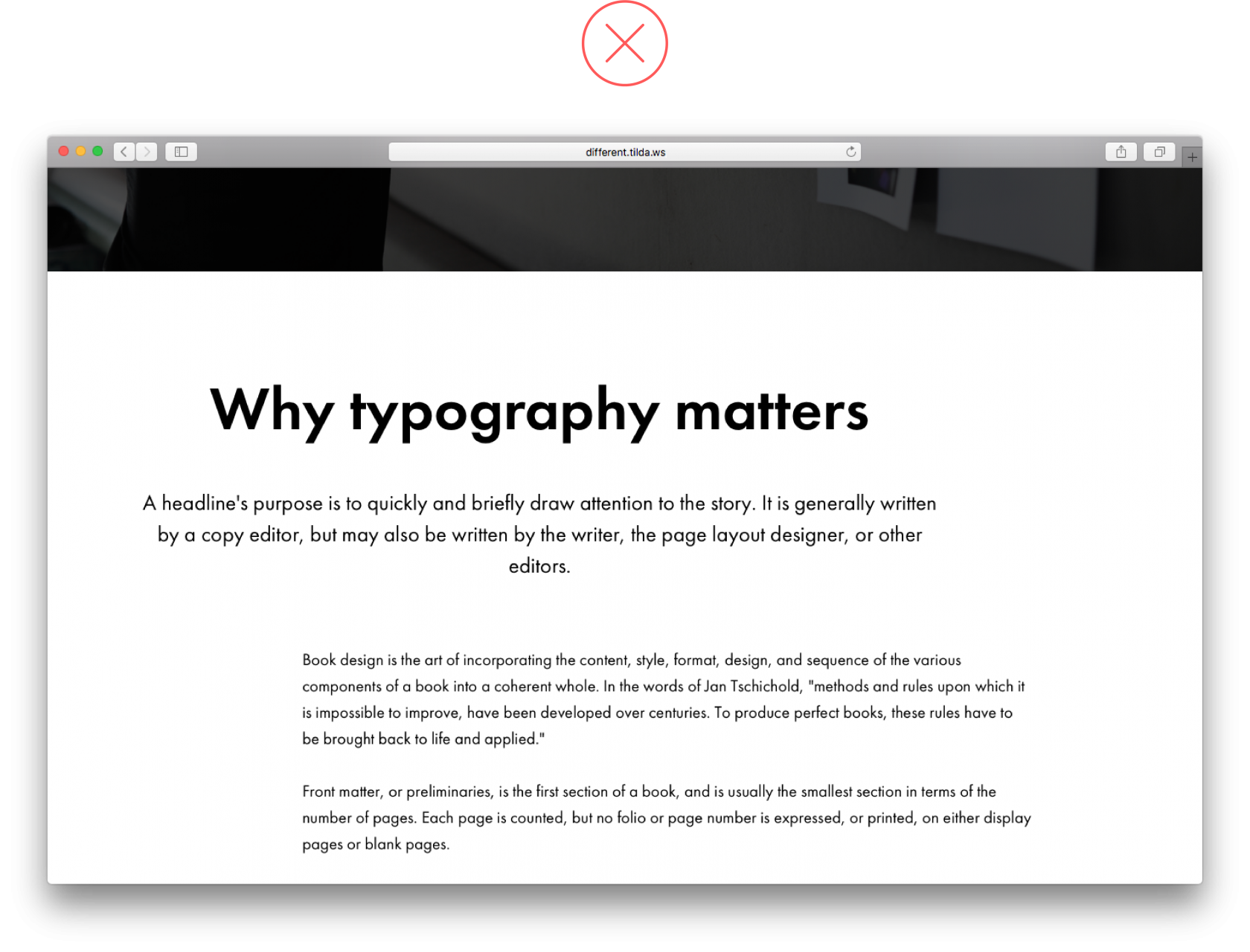
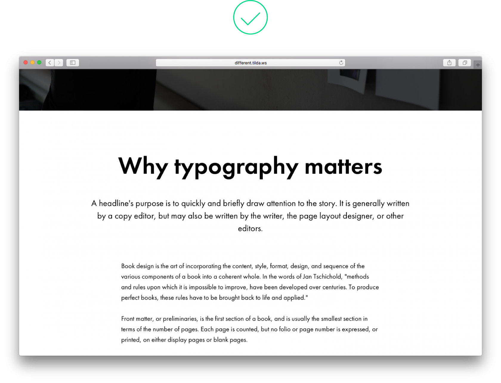
1. Content is not broken down into logical blocks
It is easier for users to digest information if it’s grouped into logical blocks. Set padding to 120 px-180 px and separate blocks of text by using colour backgrounds.
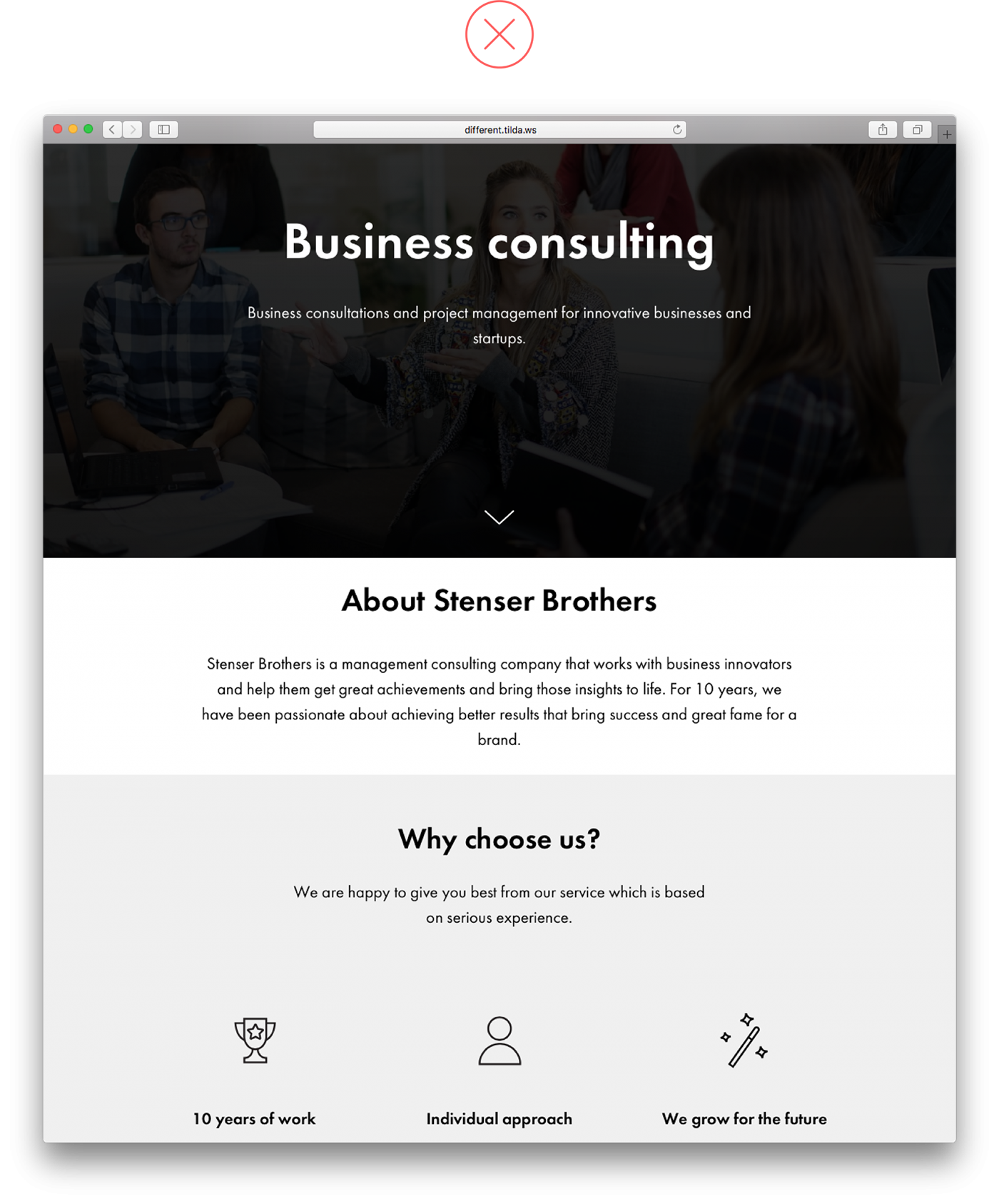
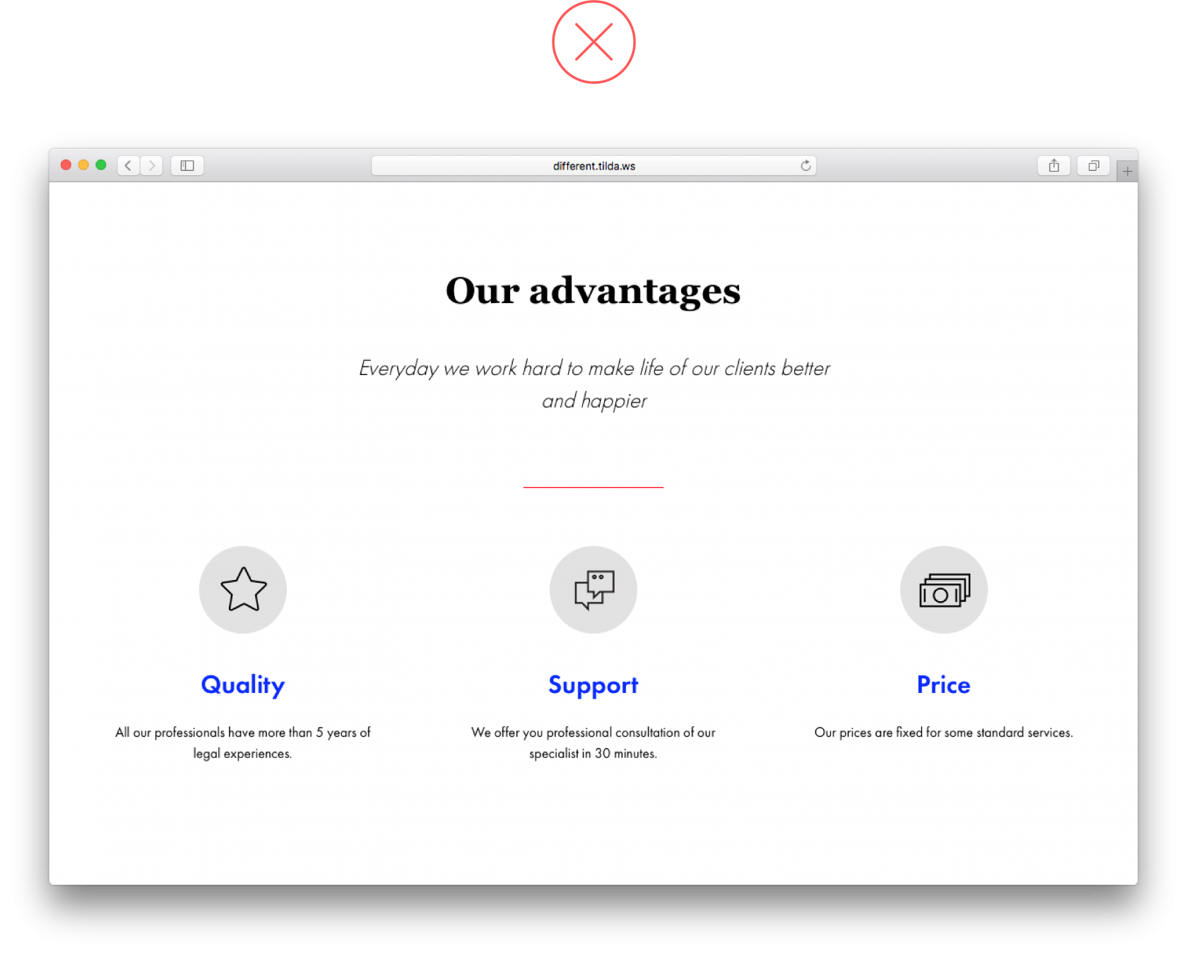
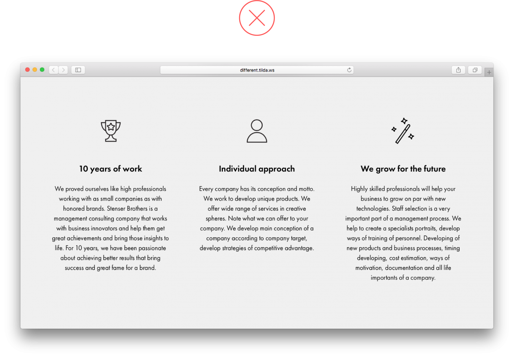
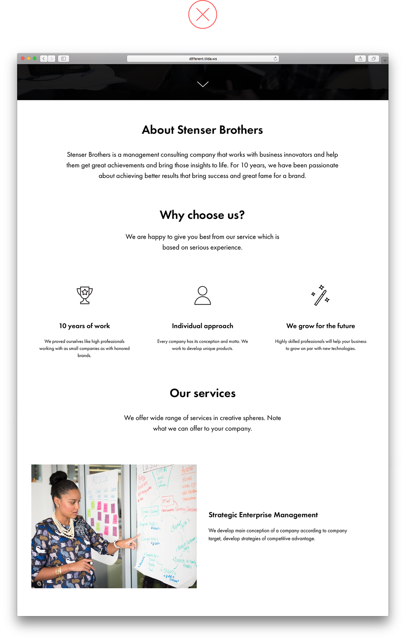 There is little padding between sets of related information, plus this design needs colour blocks to divide content into logical sets. As a result, this information is hard to digest and it is unclear which text should go with each block There is little padding between sets of related information, plus this design needs colour blocks to divide content into logical sets. As a result, this information is hard to digest and it is unclear which text should go with each block |
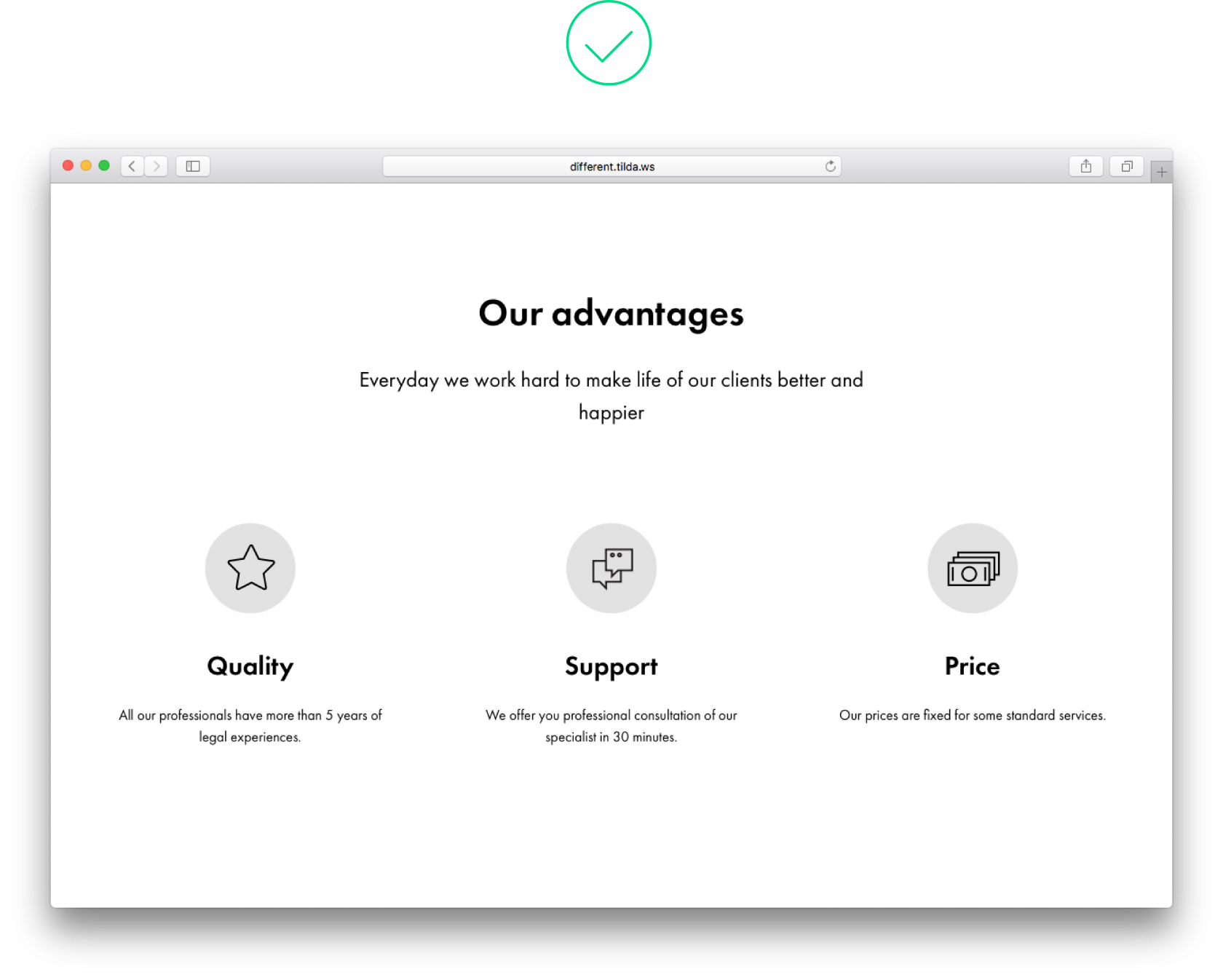
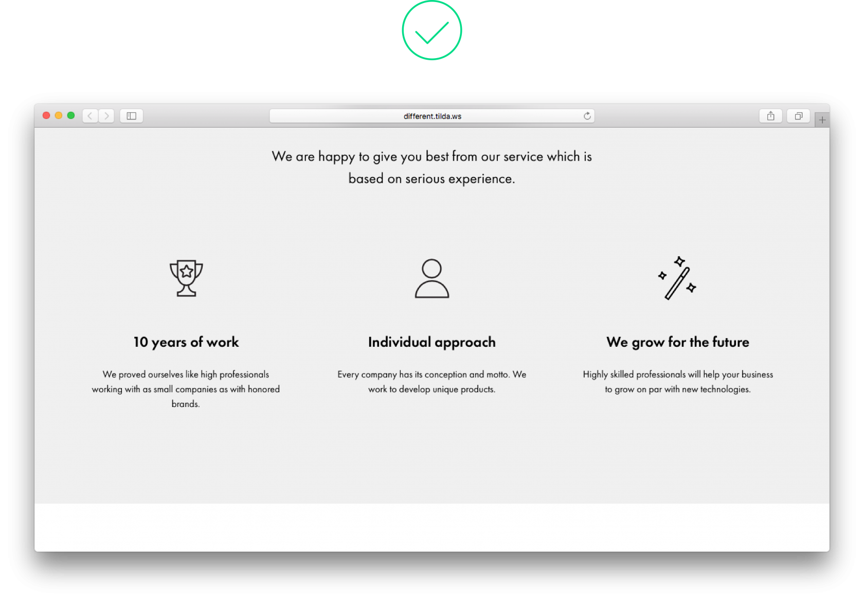
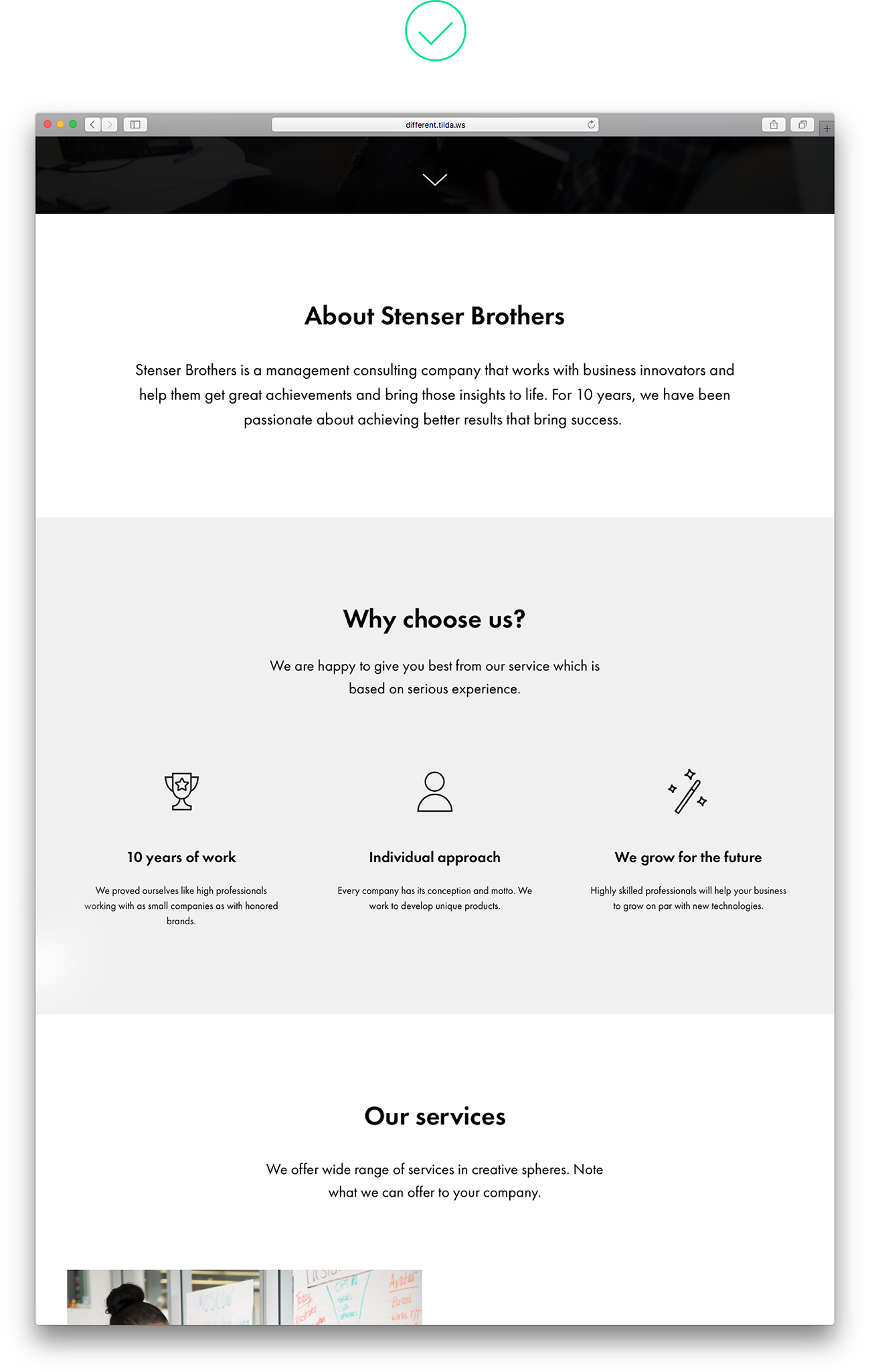 Paddings are large enough, and the blocks are separated by colour, which makes one thing immediately clear – these blocks contain different types of content Paddings are large enough, and the blocks are separated by colour, which makes one thing immediately clear – these blocks contain different types of content |
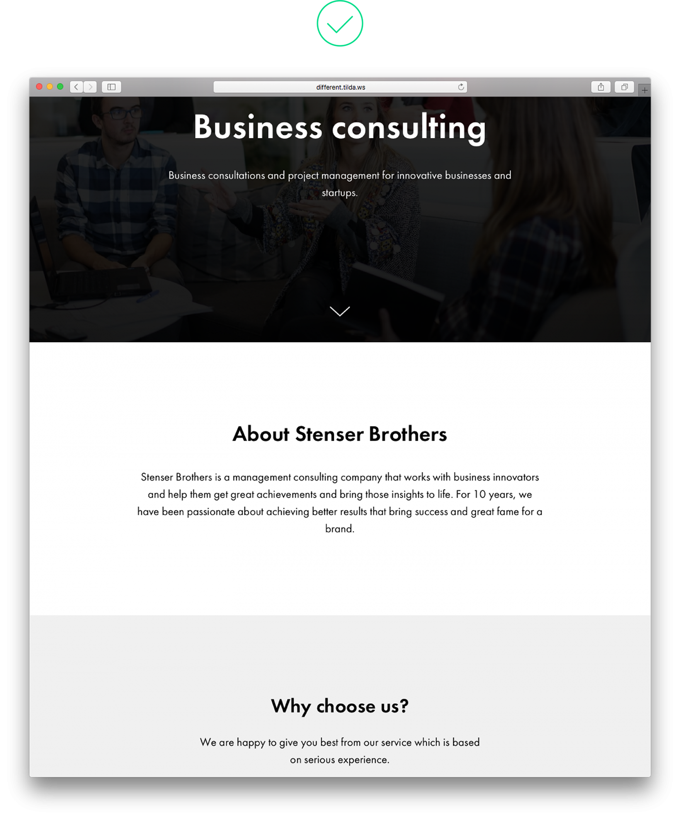
2. Uneven spaces between items on a webpage
Same-size spaces should be set around logical blocks. Otherwise your page will look messy, and users may not give equal consideration to each section.
 Spaces of various widths look uneven and create an impression that company information is linked to the header although every block is equally important Spaces of various widths look uneven and create an impression that company information is linked to the header although every block is equally important |
 Same-size spaces around headings and the body copy help perceive the logical blocks as carrying equally important information Same-size spaces around headings and the body copy help perceive the logical blocks as carrying equally important information |
3. Padding that is too small means that users cannot break down content into logical blocks
To avoid logical parts from blending in, keep them separate and insert a large space (at least 120 px) between them.
 Use narrow padding, and the blocks that make up the site stick to each other. This overloads the page and is quite confusing — a site visitor is led to believe that this is one solid text and not parts with different meaning Use narrow padding, and the blocks that make up the site stick to each other. This overloads the page and is quite confusing — a site visitor is led to believe that this is one solid text and not parts with different meaning |
 Padding is large enough so the difference between these two blocks is immediately visible Padding is large enough so the difference between these two blocks is immediately visible |
4. Avoid low contrast for text copy on an image
There should be sufficient contrast between text and background. To make copy prominent, place a contrasting filter over the image. Black is a popular colour but you could also use bright colours and mix and match them.
Another option is using a contrasting image from the start and placing the copy on top of a dark section of a photograph. 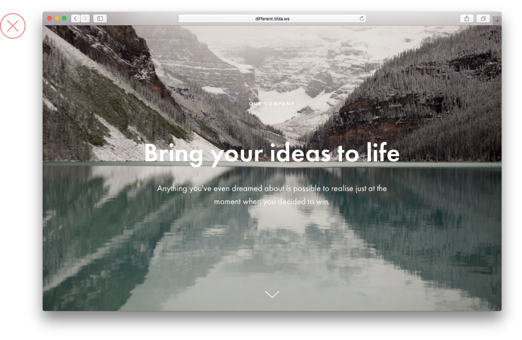 This image is too light, which makes reading the text copy too difficult
 A filter applied to the photo makes the copy easy to read
5. Too many styles on one page
Too many typographic and webpage design styles on one page make it look unprofessional and hard to read. To avoid this, limit yourself to a single font and two options for saturation, for example, normal and bold.
 Because of too many typography styles beings used, it’s unclear where the emphasis lies Because of too many typography styles beings used, it’s unclear where the emphasis lies |
 One font, one colour and two types of saturation. The typography on the page looks neat and clear One font, one colour and two types of saturation. The typography on the page looks neat and clear |
6. The colour block is too narrow
Avoid emphasising narrow page elements with colour. It just doesn’t look good. For example, headings are already well marked thanks to their size, type saturation and paddings. Would you like to highlight a particular point on a page? Use a colour background for the entire block, including a related heading and text copy.
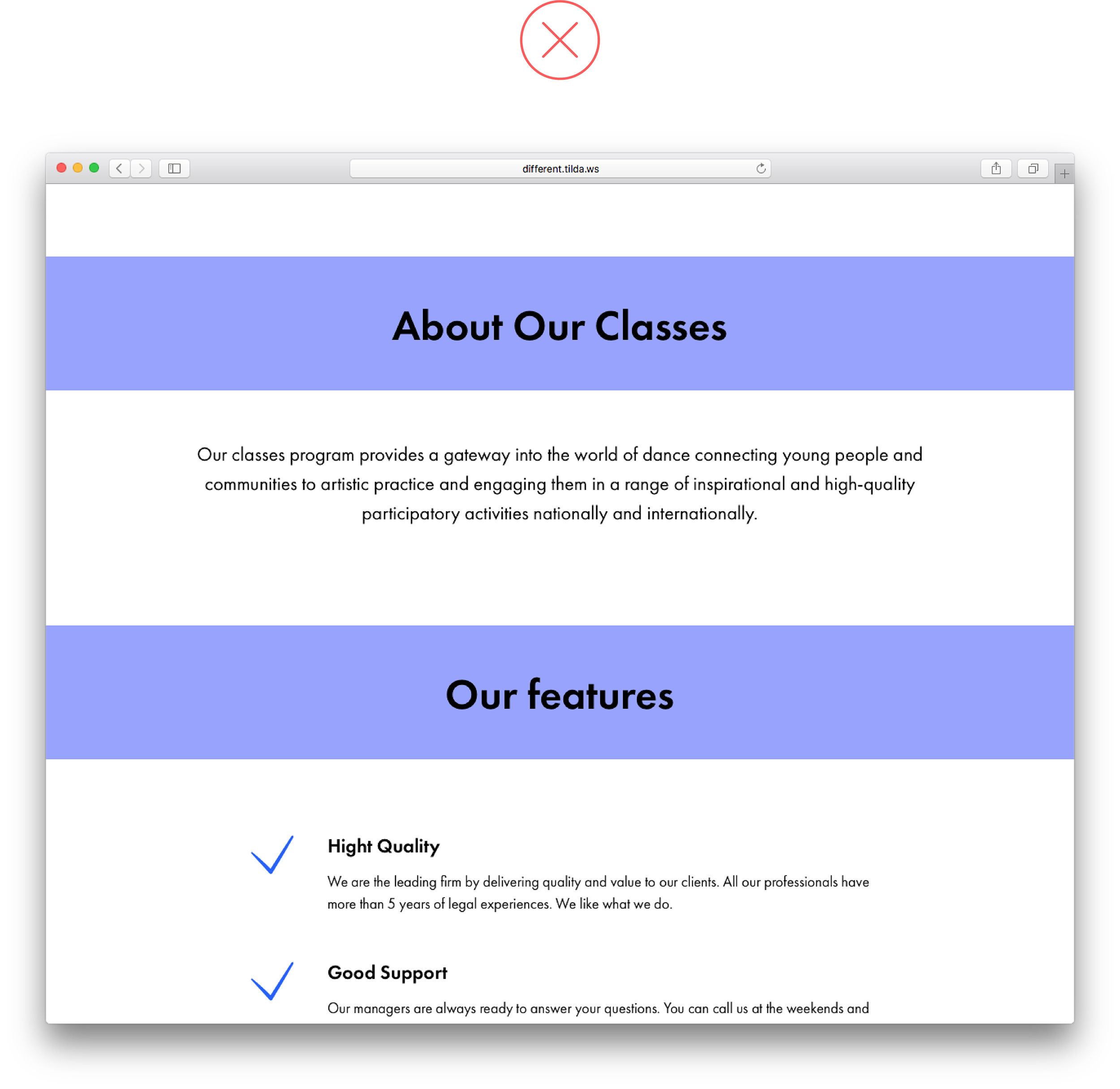 Headings placed on a colour background break up the page’s continuity and look like separate, independent design elements Headings placed on a colour background break up the page’s continuity and look like separate, independent design elements |
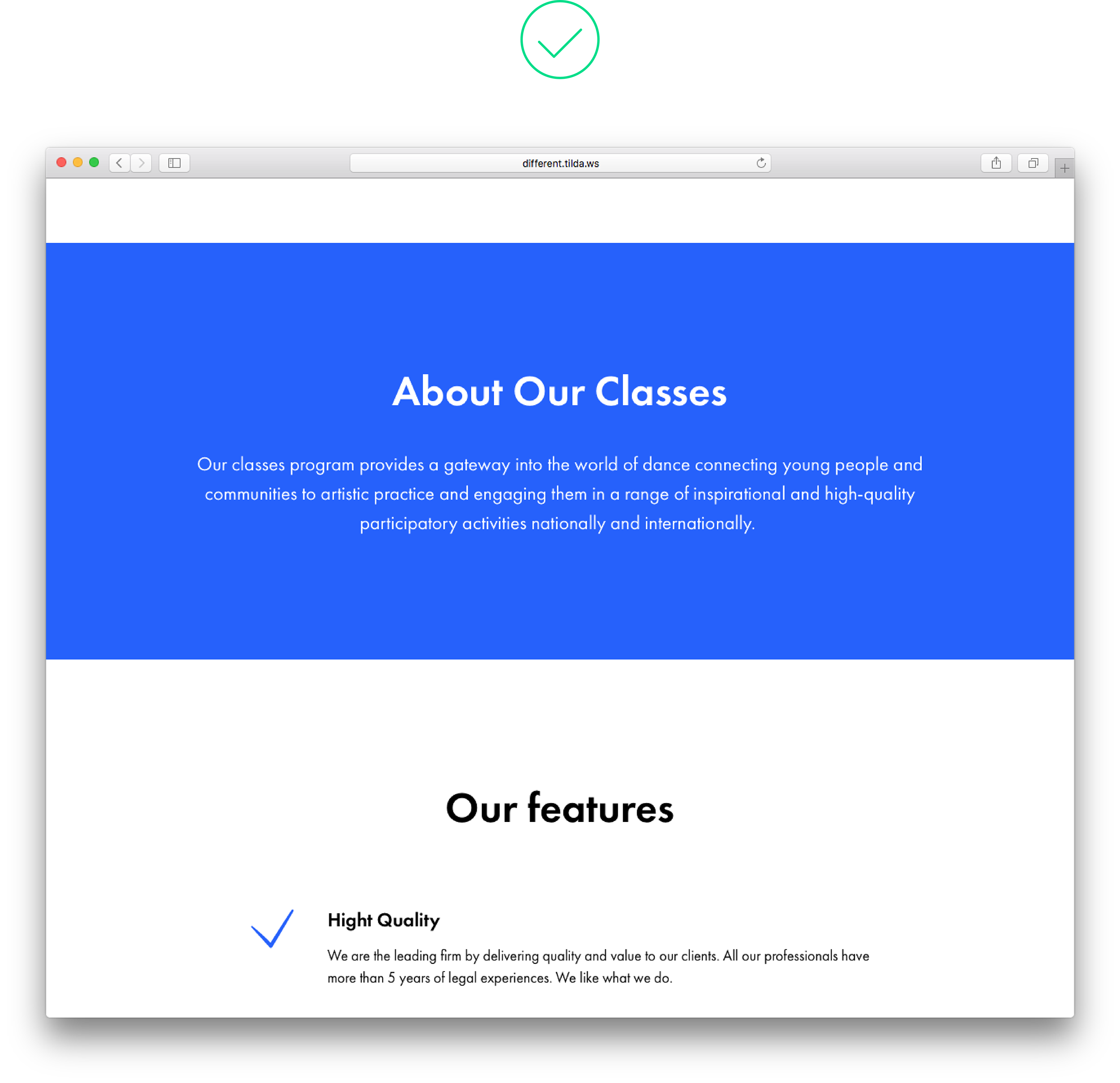 Both the heading and a related text share the same background. It shows they belong to the same logical set Both the heading and a related text share the same background. It shows they belong to the same logical set |
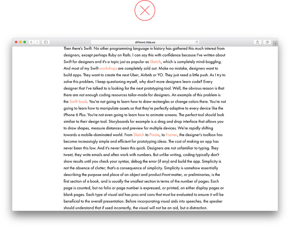
7. Too much text copy inside narrow columns
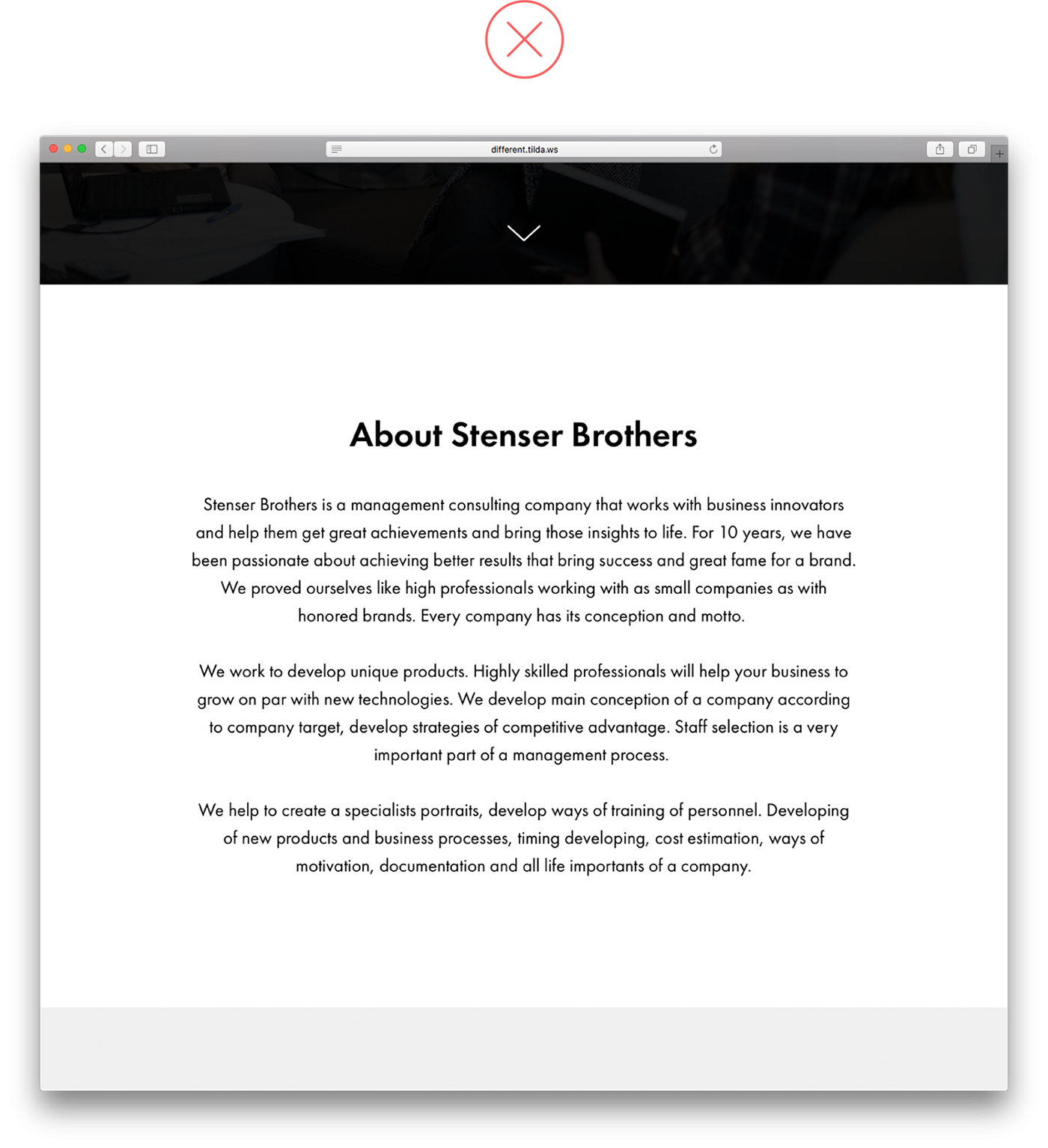
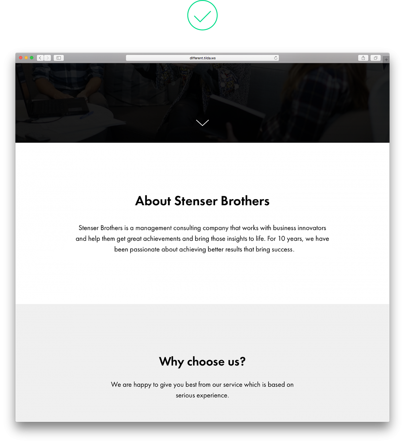
When there is a lot of text copy in narrow columns, it is difficult to read because site visitors have to skip from one line to the next. Plus, it just doesn’t look good! It’s best to cut on the number of columns and shorten the text copy, otherwise nobody will read it.
 Long, contered columns are hard to read Long, contered columns are hard to read |
 There is little text in these columns, so reading it is easy There is little text in these columns, so reading it is easy |
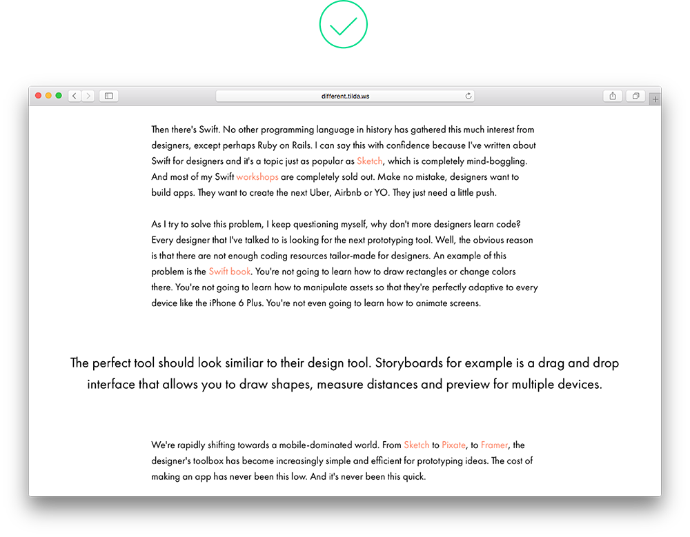
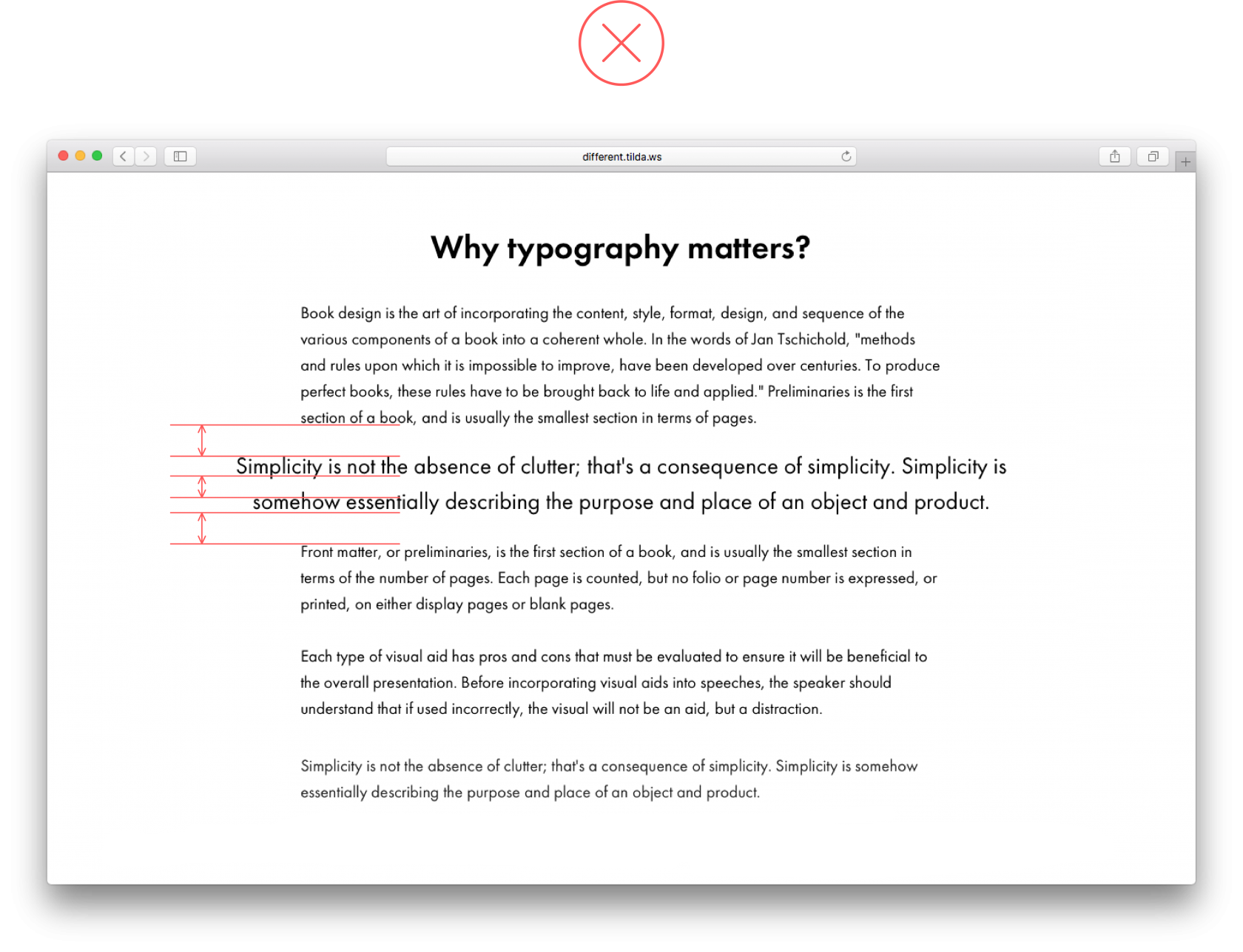
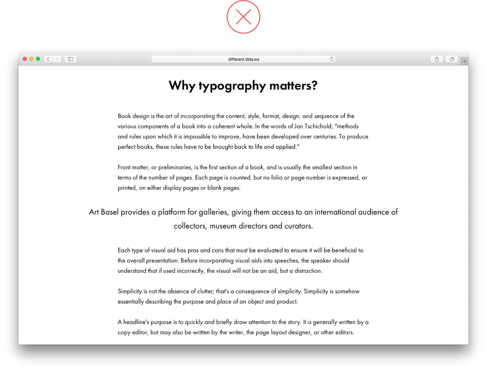
8. Too much centered text
Centering text on the page works well when there is little text, otherwise it’s hard for users to navigate it efficiently. At the same time, increase the font size starting from 24 pixels.
If you need to include a lot of text, use the blocks featuring collapsable text copy (in Tilda, it’s blocks TX12, TX16N or the button BF703).
 Long, centered texts are not easy to read Long, centered texts are not easy to read |
 A short text under a headline (both centered) look good on a page A short text under a headline (both centered) look good on a page |
9. Text copy is superimposed over an essential part of an image
Avoid covering meaningful parts or small details of an image with text. This way, you will both obscure the image and make the text illegible. Try different positions for the lines such as centering them or aligning text left or placing them vertically.
 This headline gets in the way of the woman’s face. With so many tiny details, it’s hard to read the text This headline gets in the way of the woman’s face. With so many tiny details, it’s hard to read the text |
 The image and text copy are easy to read and form good composition The image and text copy are easy to read and form good composition |
10. Misusing visual hierarchy
For information hierarchy to be clearly visible on a page, the title on the cover should be bigger than the rest of the headings or at least the same size, especially if the headline is long, for example.
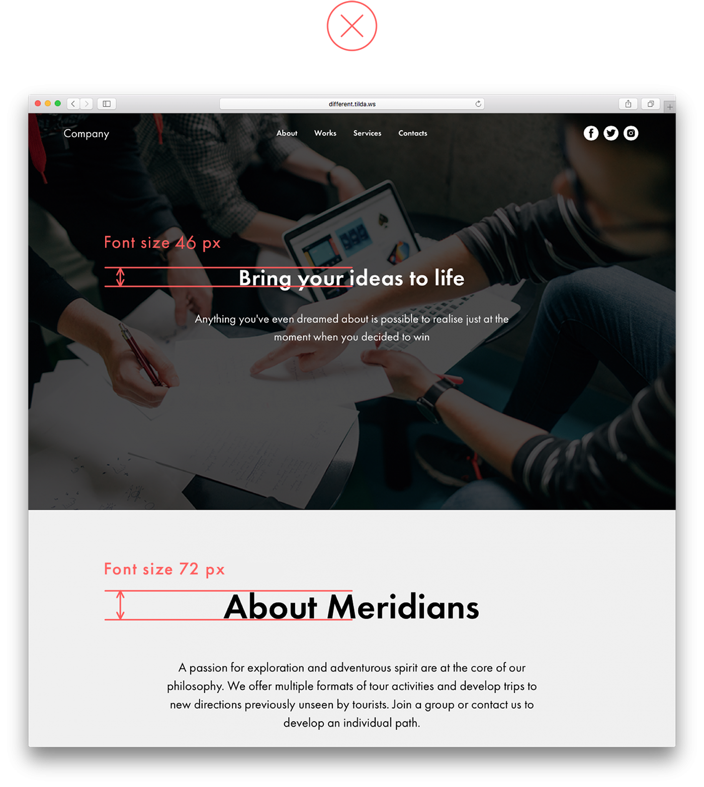 The heading on the header is disproportionally smaller than the following heading, which is confusing. Why? It makes the second heading appear more prominent The heading on the header is disproportionally smaller than the following heading, which is confusing. Why? It makes the second heading appear more prominent |
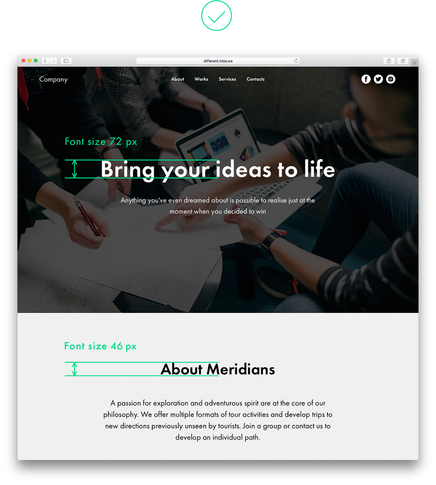 The heading on the header is bigger than the one in the following block, so the whole page looks consistent The heading on the header is bigger than the one in the following block, so the whole page looks consistent |
The same principle applies to visual hierarchy within a logical block. The headline should be the largest design element on the page, followed by a smaller, less prominent subhead. Next, features titles that follow should be noticeably smaller than the heading, and of the same weight. The smallest fonts should be used for features descriptions.
This will help site visitors distinguish between the most important and less important information.
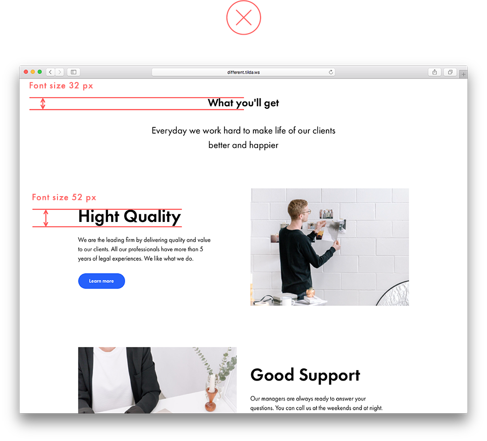 The headline is smaller than features titles and seems secondary, although it’s more important in this context The headline is smaller than features titles and seems secondary, although it’s more important in this context |
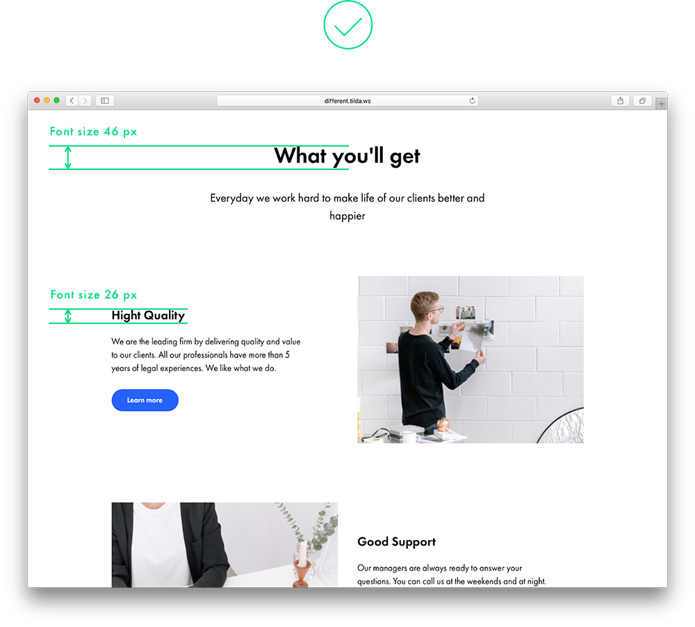 The headline is the most prominent design element on the page and although features titles are written in a smaller type, they are still clearly visible The headline is the most prominent design element on the page and although features titles are written in a smaller type, they are still clearly visible |
11. One logical set is split into two
A full-screen image or gallery, following a text, resembles a separate, independent block. If you add padding around the gallery, both text copy and images will look as a logical whole thanks to a shared background.
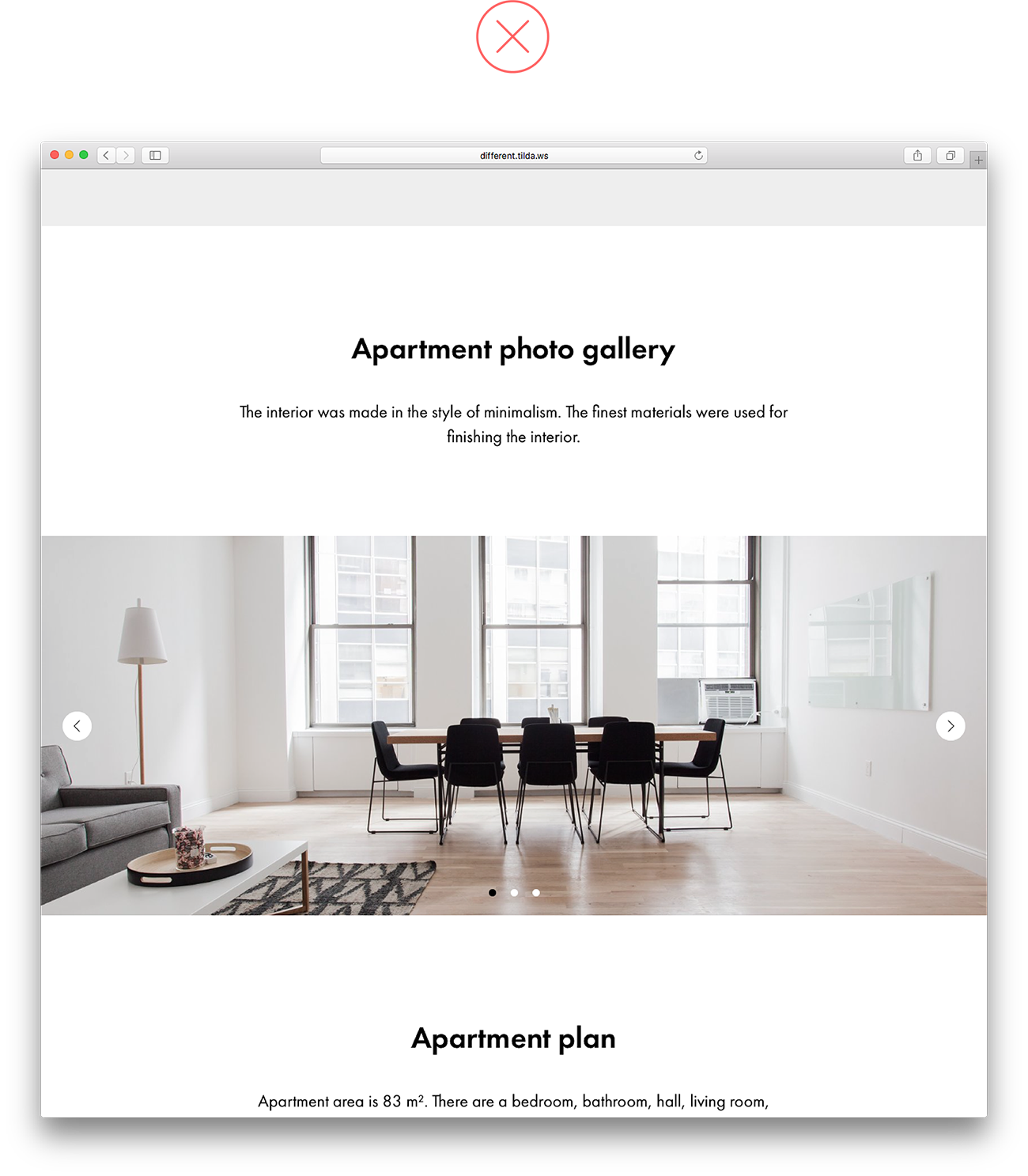 A full-screen gallery looks disjointed from the headline above and looks like a standalone block A full-screen gallery looks disjointed from the headline above and looks like a standalone block |
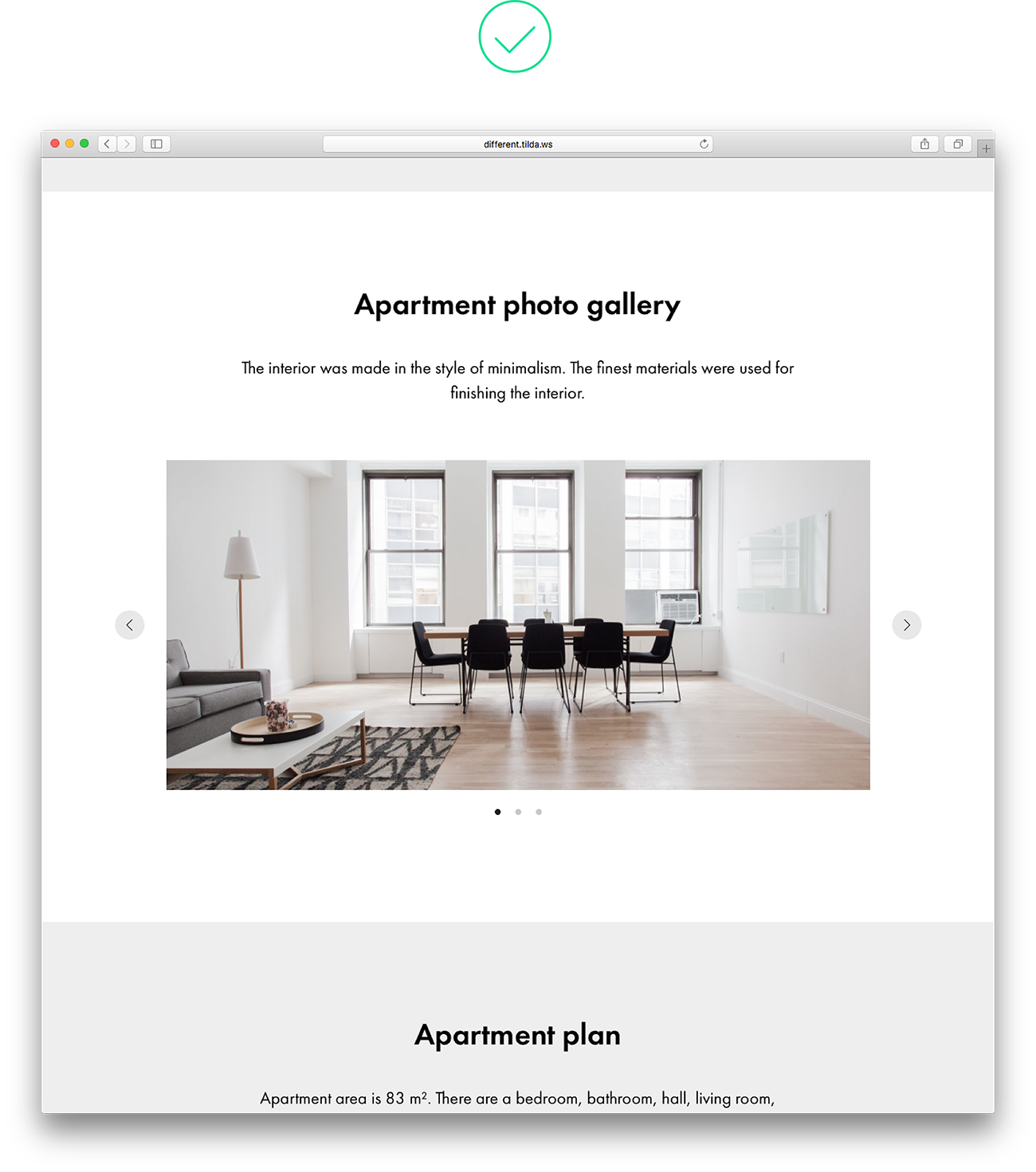 The gallery shares the same backdrop as the heading right above it, which makes the whole composition look solid The gallery shares the same backdrop as the heading right above it, which makes the whole composition look solid |
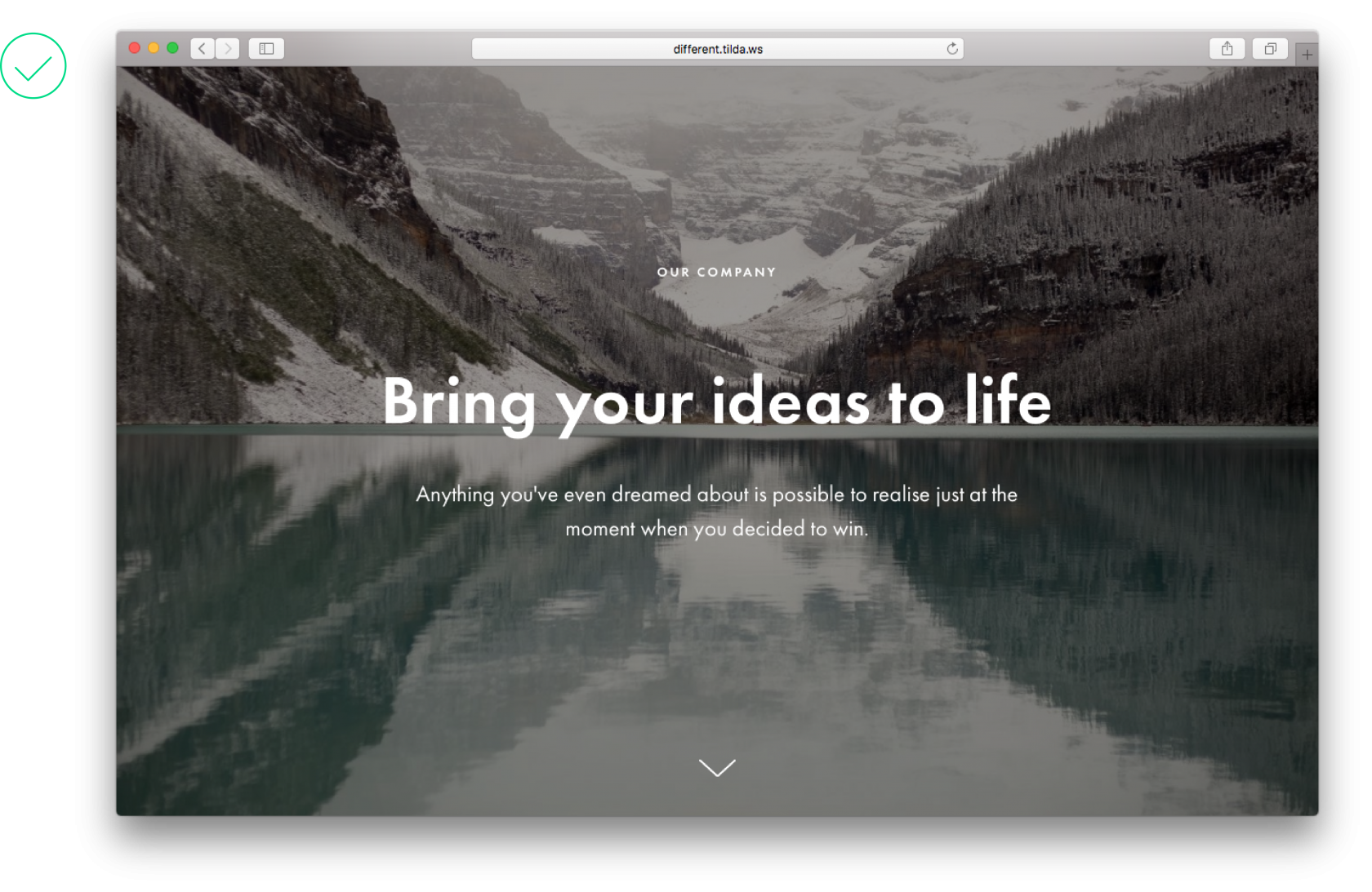
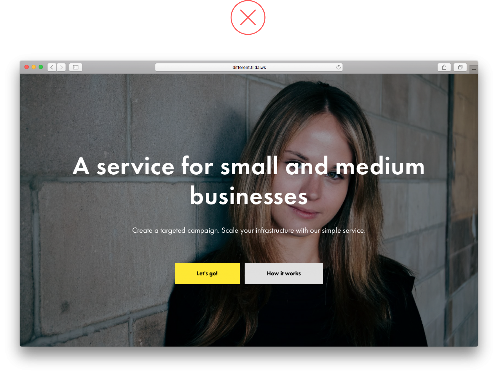
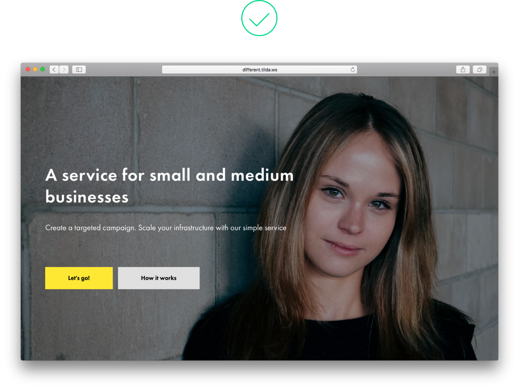
12. The title is too large and long
A very large font is perfect for a short sentence. If the headline is long, use a smaller size font. It will be easy to read and leave plenty of space to all other design elements on the page.
 A headline that is too big takes up an entire cover, while design elements jostle for space and the headline is hard to read A headline that is too big takes up an entire cover, while design elements jostle for space and the headline is hard to read |
 This page is composed well, all the design elements are in balance with each other, and the copy is easy to read This page is composed well, all the design elements are in balance with each other, and the copy is easy to read |
13. Wrong use of border styling for buttons
Borders are necessary when a button is transparent. Adding a border for a colour button does not make sense, it’s just another meaningless design feature that overloads a page and makes it difficult to read it. 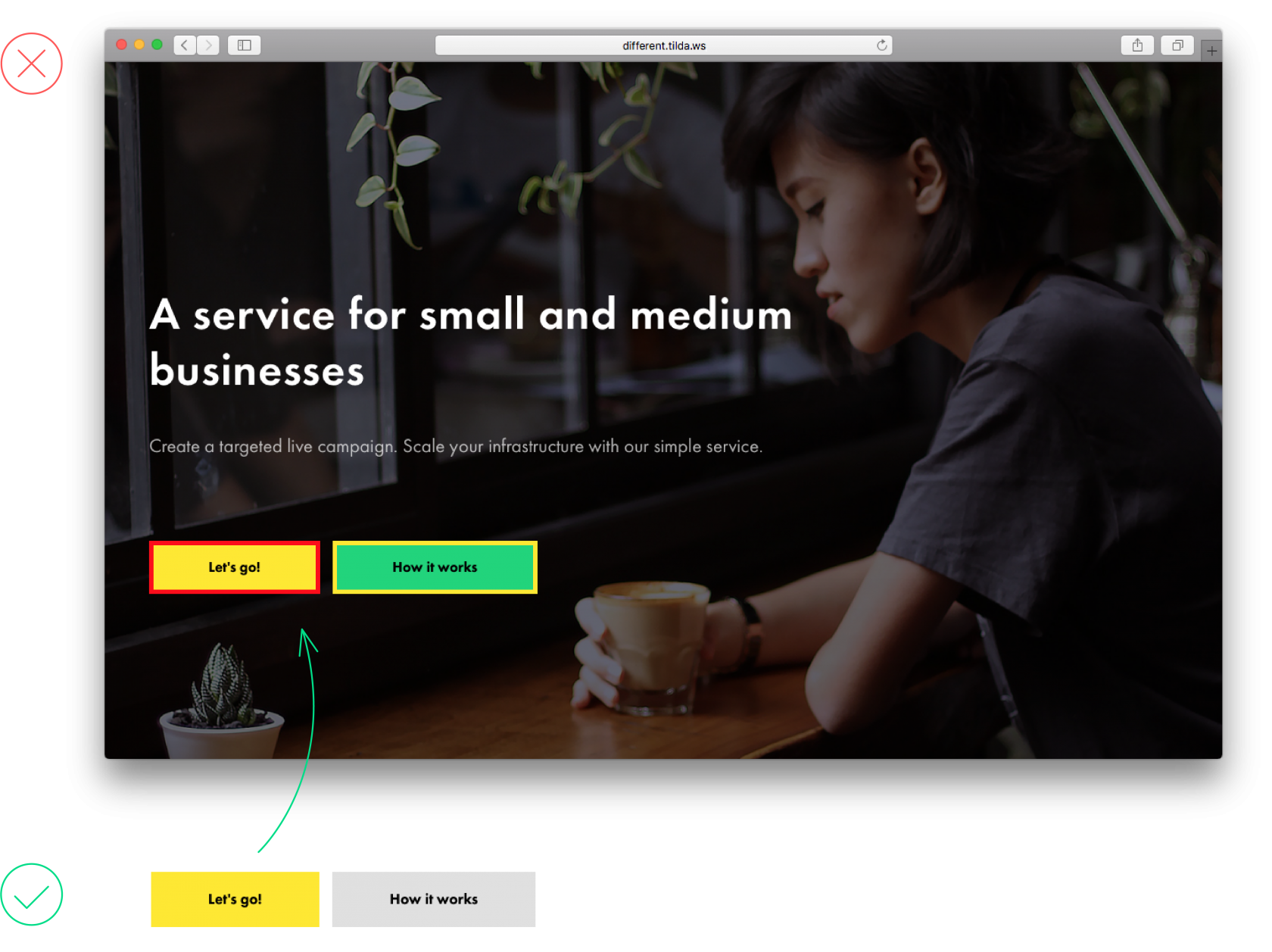
14. Using too many colours
Using too many colours on a page is confusing, and it’s unclear which bits are more important. One or two colours are enough to give visual prominence to what’s really important.
 There are too many bright colours on the page; this is confusing There are too many bright colours on the page; this is confusing |
 One colour accent creates variety and doesn’t distract from the contents of the page One colour accent creates variety and doesn’t distract from the contents of the page |
15. Overloaded menu
People visit websites to find solutions to their problems. Help them! Use the menu to help people navigate the website and find what they need quickly and easily. Don’t overload them with with excessive information. It’s enough to have 5-7 menu items.  This menu carries too much information, making site navigation more difficult
 A simple menu makes finding what you need easy
Mistakes in article design
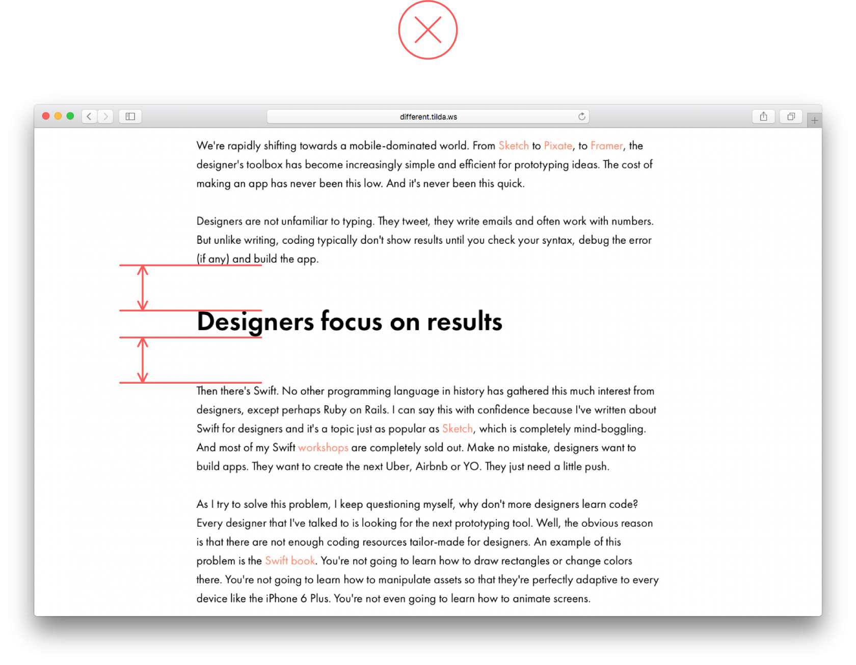
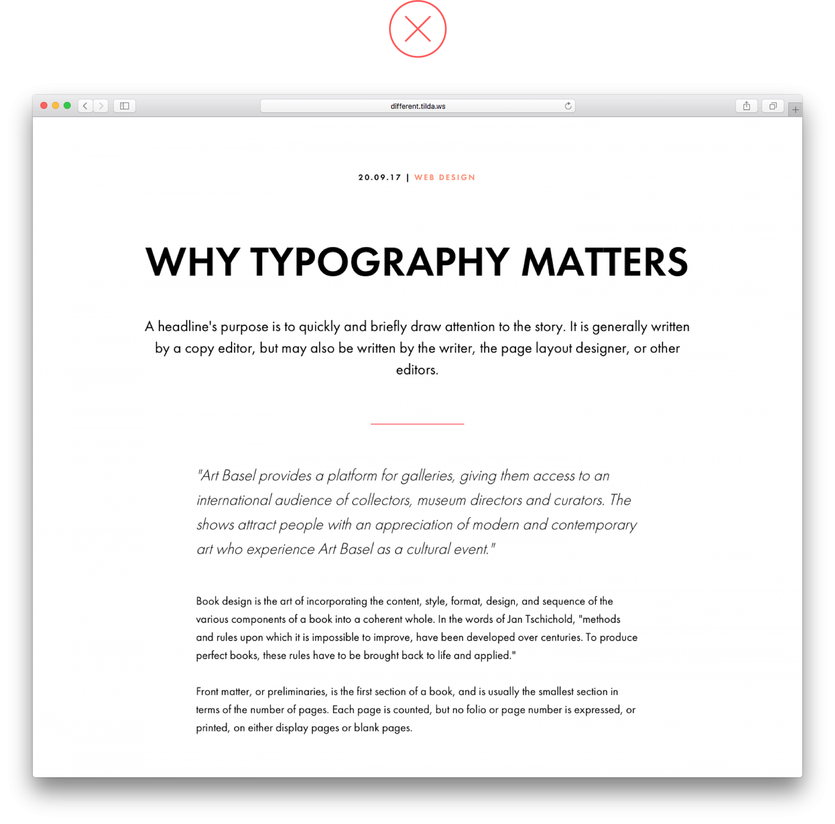
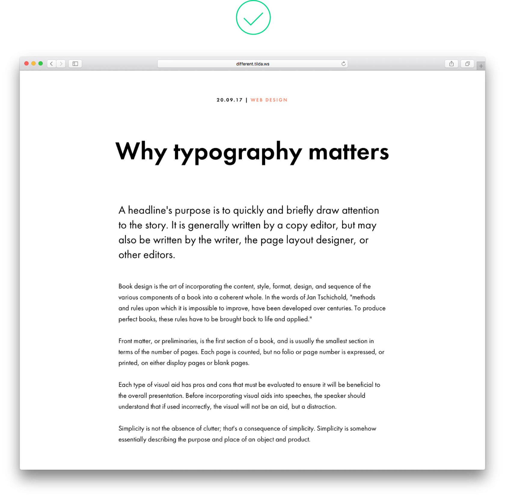
1. Long, solid copy
A wall of text makes reading difficult to understand. For easy navigation, split it into paragraphs or introduce breaks such as a key phrase or an image.
 A wall of text is hard to look at A wall of text is hard to look at |
 Elements such as pull quotes or images make reading texts easier Elements such as pull quotes or images make reading texts easier |
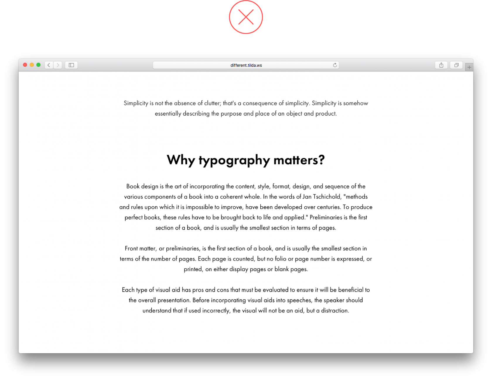
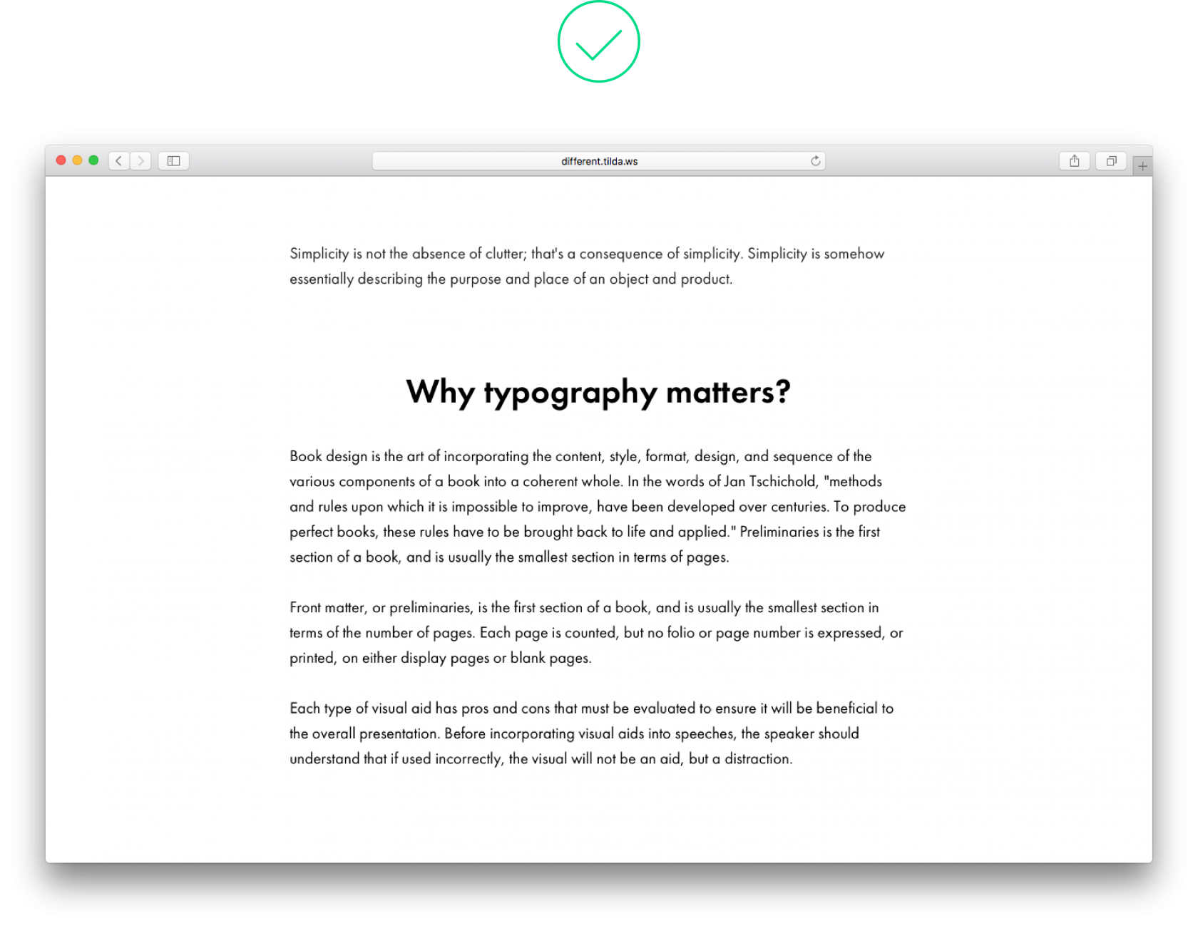
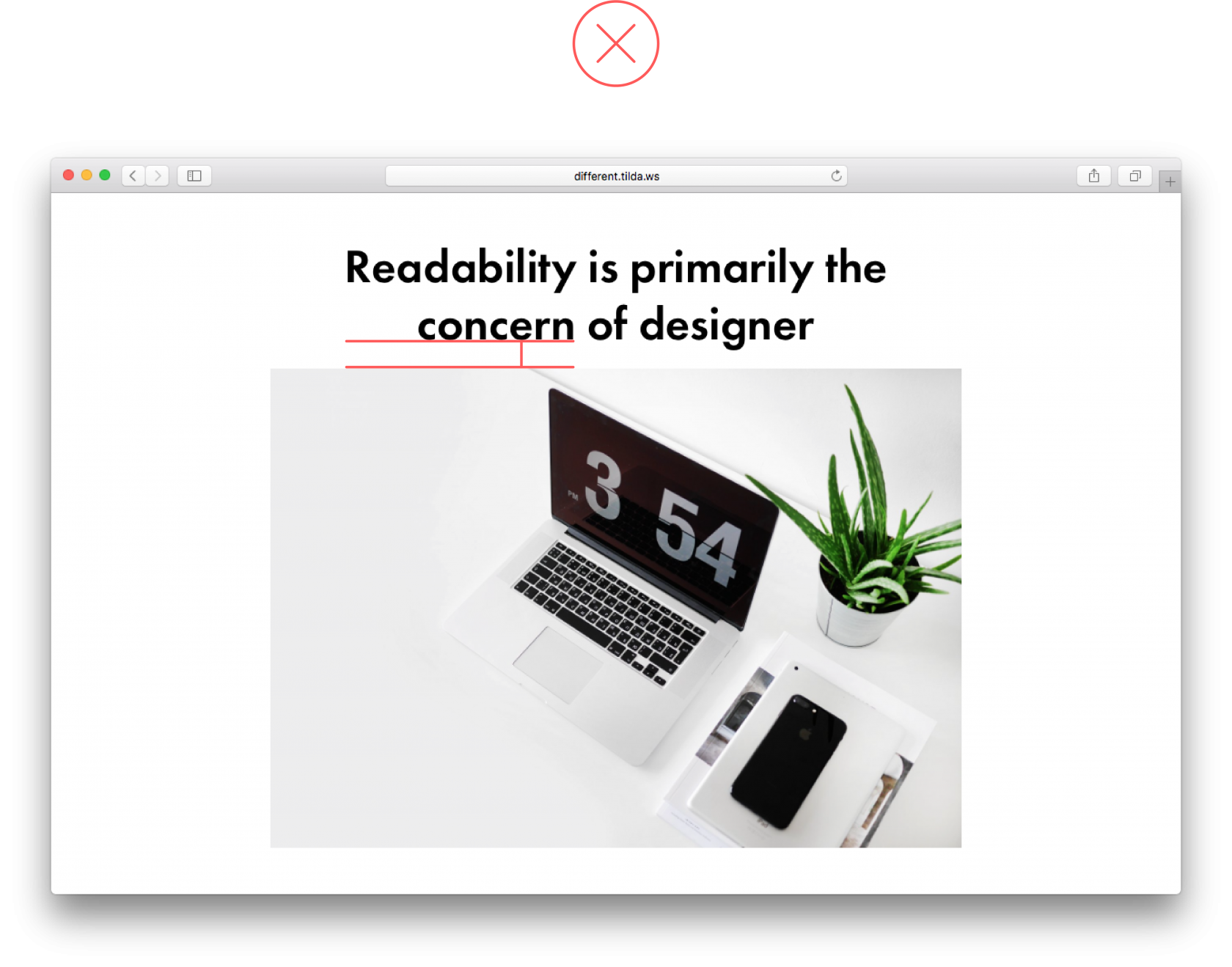
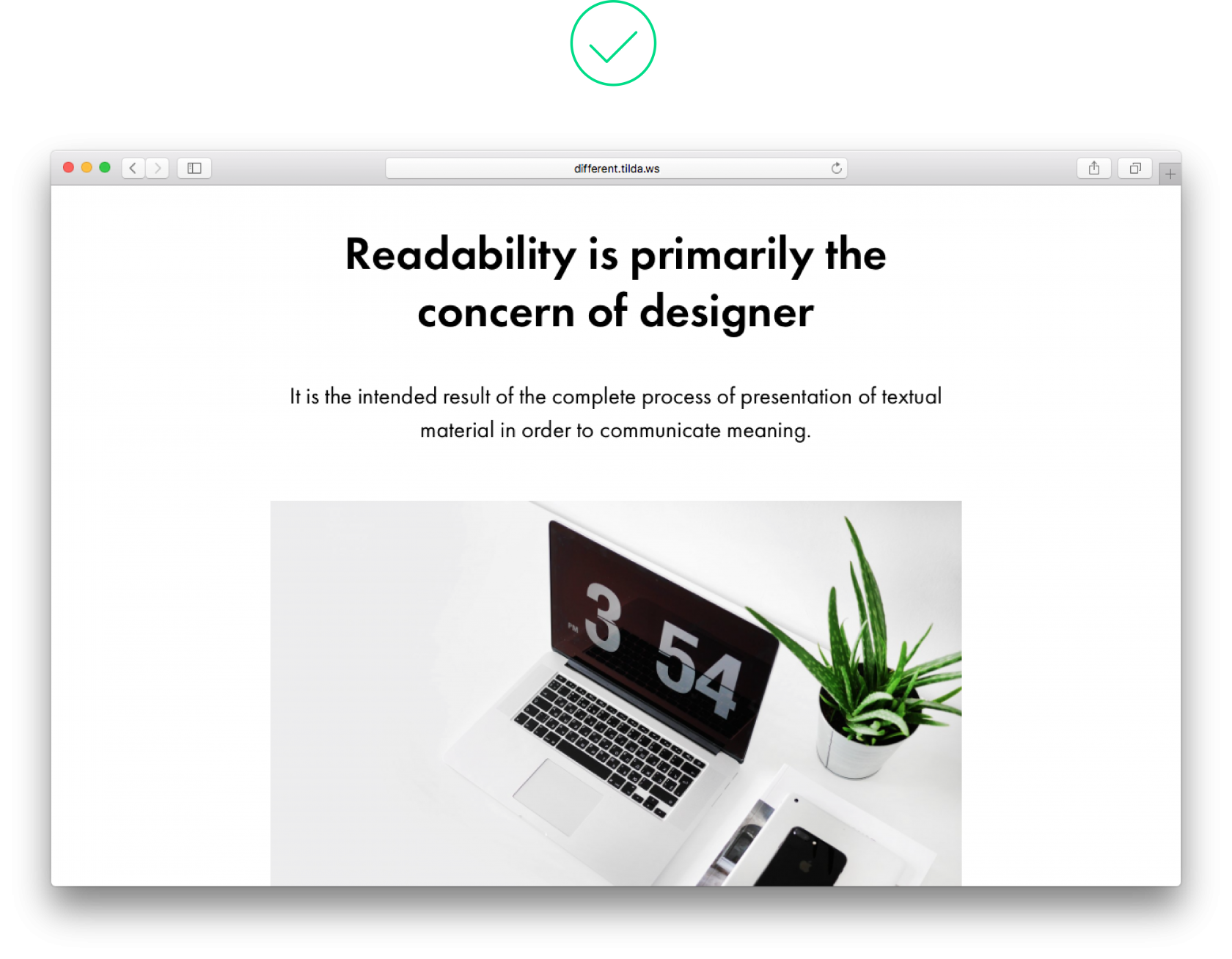
2. Headline is positioned at the same distance between previous and next paragraphs
A headline should not ‘hang’ between chapters at a similar distance because it belongs to the paragraph that follows. The distance above a headline should be 2-3 times bigger than the space under it. At the same time, the distance under a headline should be roughly the same as the space between paragraphs, or slightly larger. This way, the header will visually refer to the subsequent text.
 The heading is positioned at an equal distance between paragraphs above and below it, and it’s unclear which paragraph it belongs with The heading is positioned at an equal distance between paragraphs above and below it, and it’s unclear which paragraph it belongs with |
 Thanks to the use of padding under the heading, it’s obvious that the heading belongs with the text that follows Thanks to the use of padding under the heading, it’s obvious that the heading belongs with the text that follows |
3. There is no logical order
In typography, contrasting is used to visually divide different levels of text and establish a strict hierarchy. Main headings should be the most prominent on page, subheads should be considerably smaller but still clearly visible.
 A heading and subhead are approximately the same size, and there is no clear hierarchy between them A heading and subhead are approximately the same size, and there is no clear hierarchy between them |
 Logically, the heading is more important than a subhead Logically, the heading is more important than a subhead |
4. Different padding above and below blocks
If blocks carry the same weight, they should have the same look and feel and be positioned at an equal distance from each other.
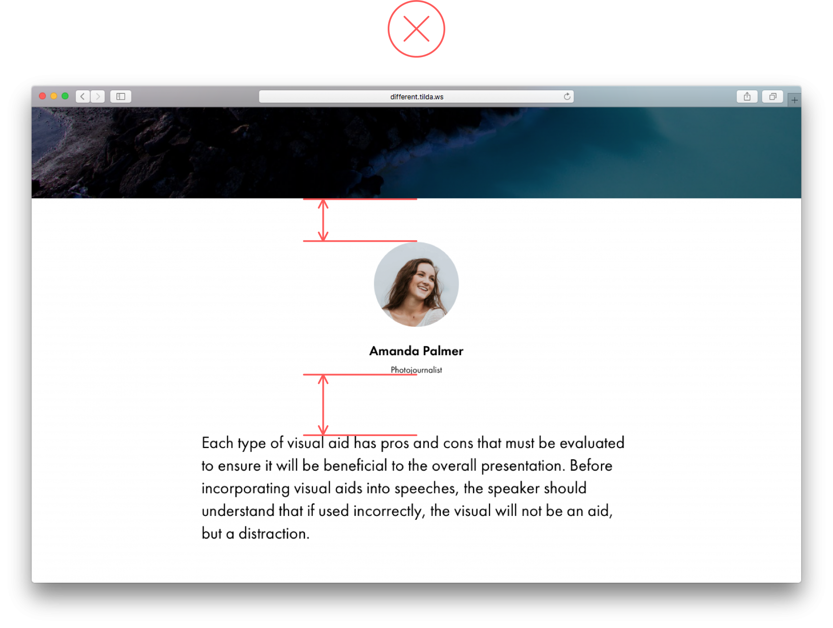 If the space between the header and an author’s image is too narrow, it looks as if the author has more to do with the header rather than the text that follows If the space between the header and an author’s image is too narrow, it looks as if the author has more to do with the header rather than the text that follows |
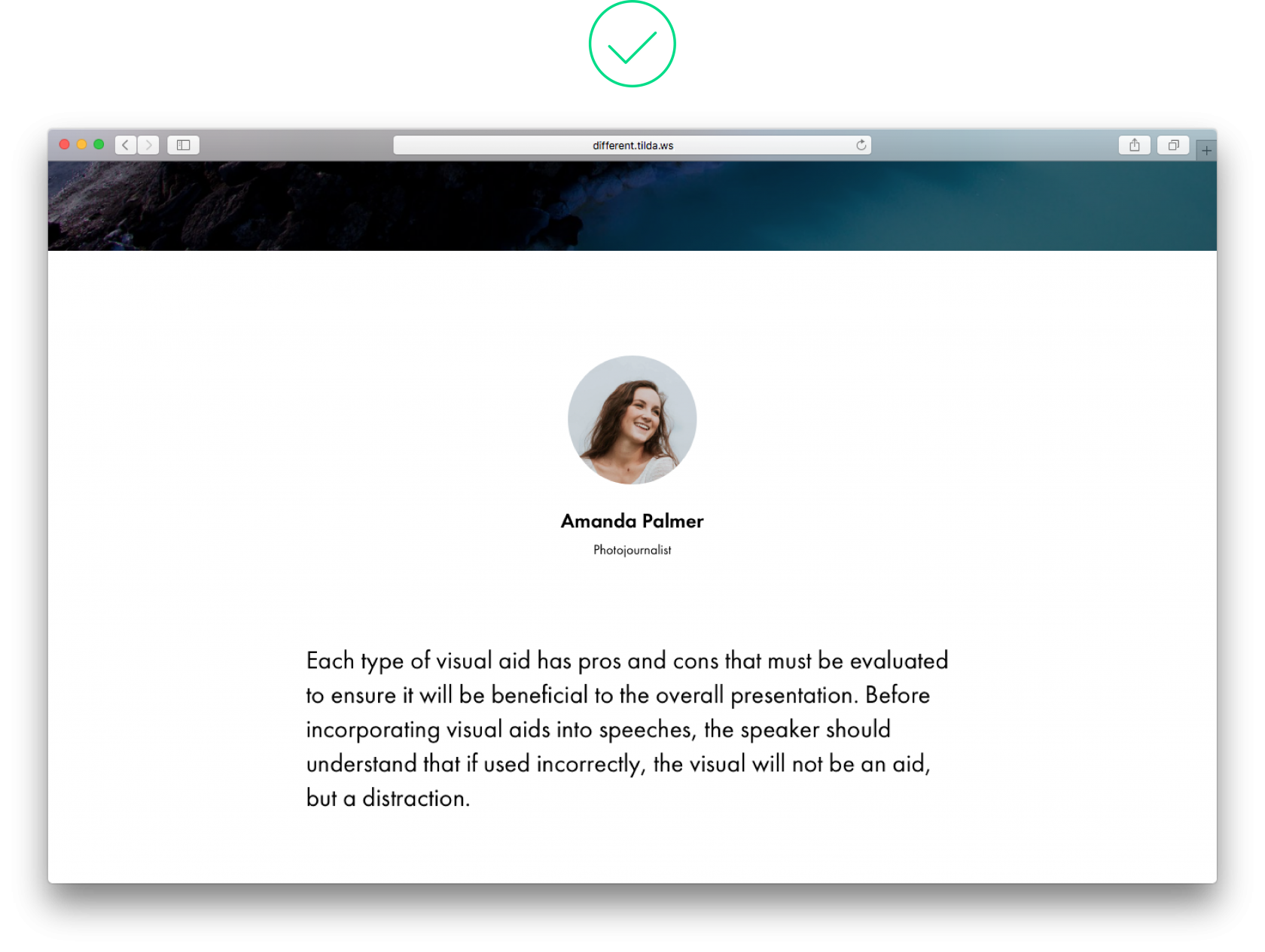 Thanks to identical size padding above and below the image, blocks appear equal Thanks to identical size padding above and below the image, blocks appear equal |
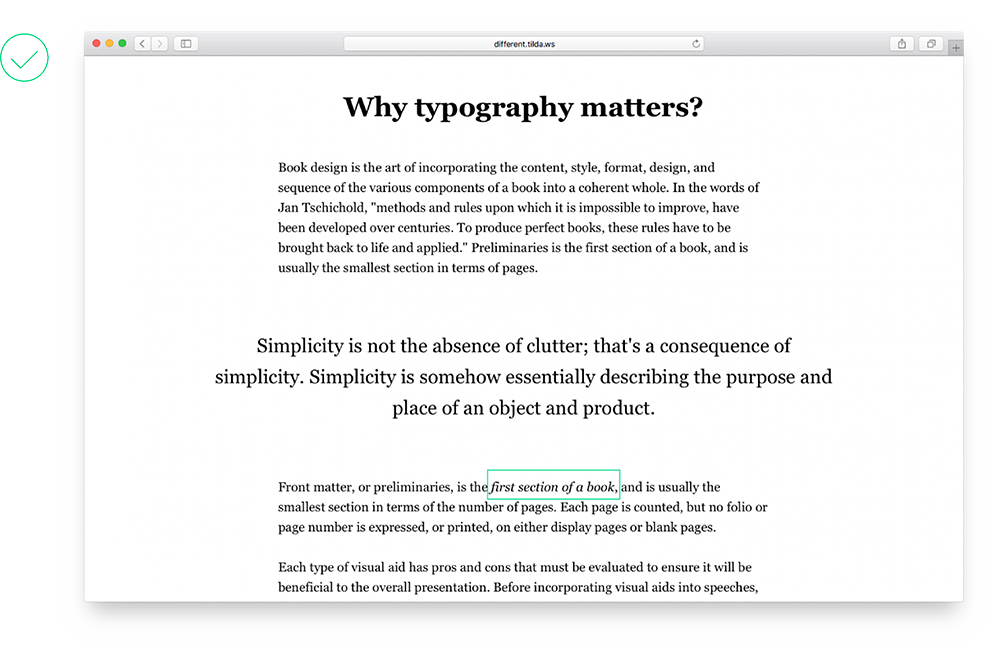
5. Caption is positioned too close to an image
On one hand, an illustration and its caption form a whole but these are two separate design elements, and captions should not interfere with images.
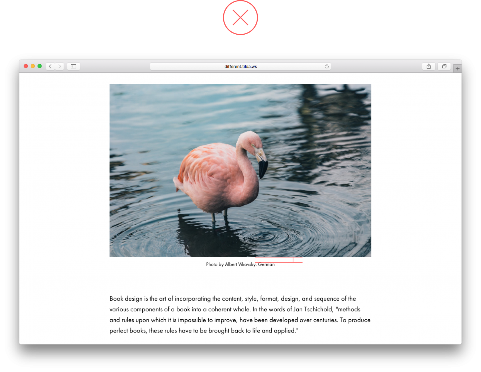 The caption sticks to the image and we have trouble properly engaging with either of them The caption sticks to the image and we have trouble properly engaging with either of them |
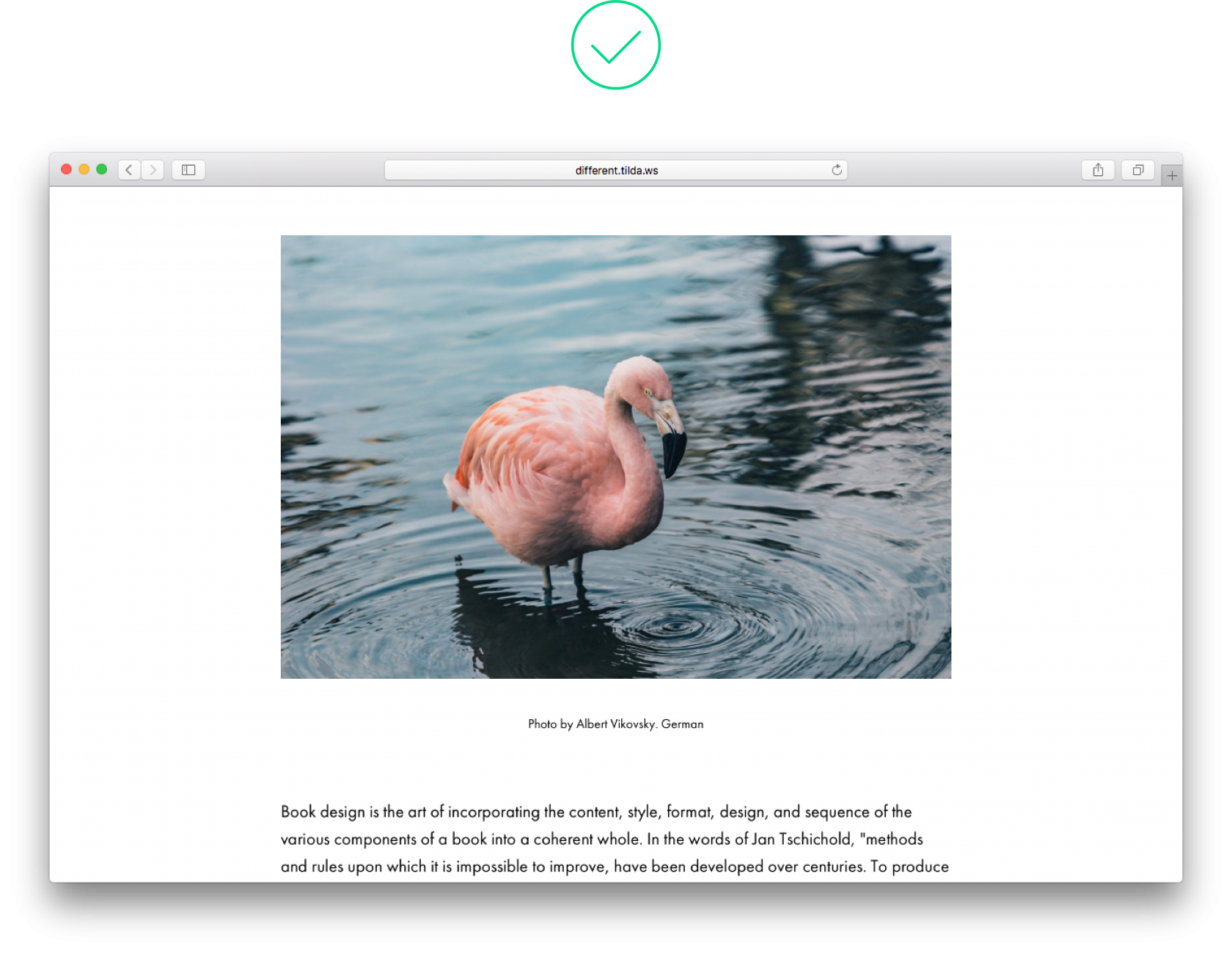 There is a lot of white space between the image and its caption, yet it’s clear that the caption goes with the image There is a lot of white space between the image and its caption, yet it’s clear that the caption goes with the image |
6. There is too little space between subhead and text copy
A subhead and text copy that follows belong together but if the space between paragraphs in an article is bigger than the space between the subhead and the following paragraph, the article looks disjointed.
 Space between a heading and a paragraph is smaller than between paragraphs themselves Space between a heading and a paragraph is smaller than between paragraphs themselves |
 Space after the heading is slightly bigger than space between paragraphs Space after the heading is slightly bigger than space between paragraphs |
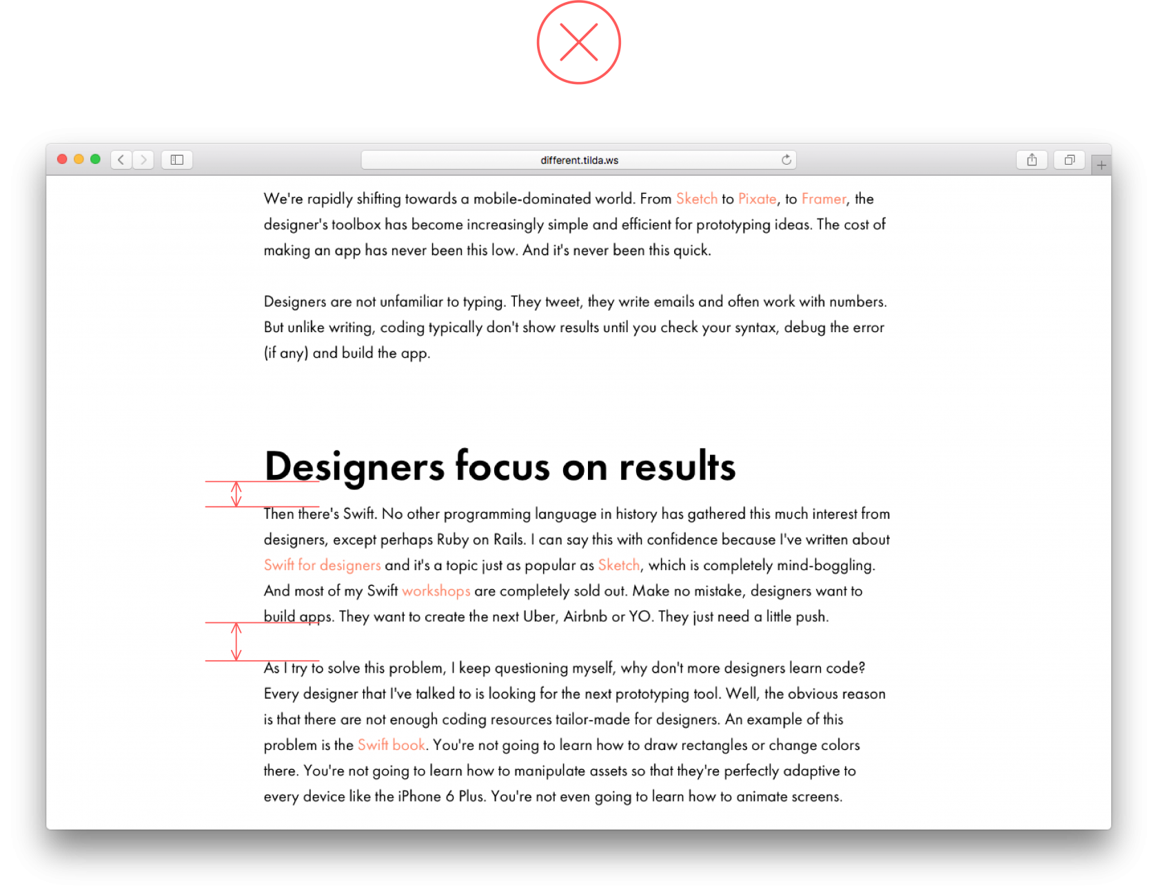
7. Stand-out design elements are placed too close to the main text
Design elements used as expressions of emphasis such as key phrases or quotes are independent objects. For them to truly stand out, set them at 75-120 px from the main body copy.
 There is too little space between the main text and stand-out elements There is too little space between the main text and stand-out elements |
 A pull quote truly stands out thanks to big padding A pull quote truly stands out thanks to big padding |
8. Low-contrast design elements
If you’d like to emphasise a certain phrase, be bold, make a key phrase bigger than the main text by 10-15 px. Let the key phrase really stand out from the rest of the text.
 |
 Now everyone can see it thanks to a large font and sufficient padding around the text Now everyone can see it thanks to a large font and sufficient padding around the text |
9. Colour background for a narrow text block
If you’d like to highlight a small section of a page such as author information, it’s enough to set sufficient padding around this, which will create an impression of space. Don’t place this section on a colour background; this will look out of place.
 Don’t use colour for the subhead. Using a bigger font and padding should be sufficient to make it pop on the page Don’t use colour for the subhead. Using a bigger font and padding should be sufficient to make it pop on the page |
 |
10. There is an empty space between two full-screen images
When you are using several full-screen images in a sequence, avoid leaving a space between them. The border will still be visible, and there is no need to add an additional design element. It just doesn’t add anything.
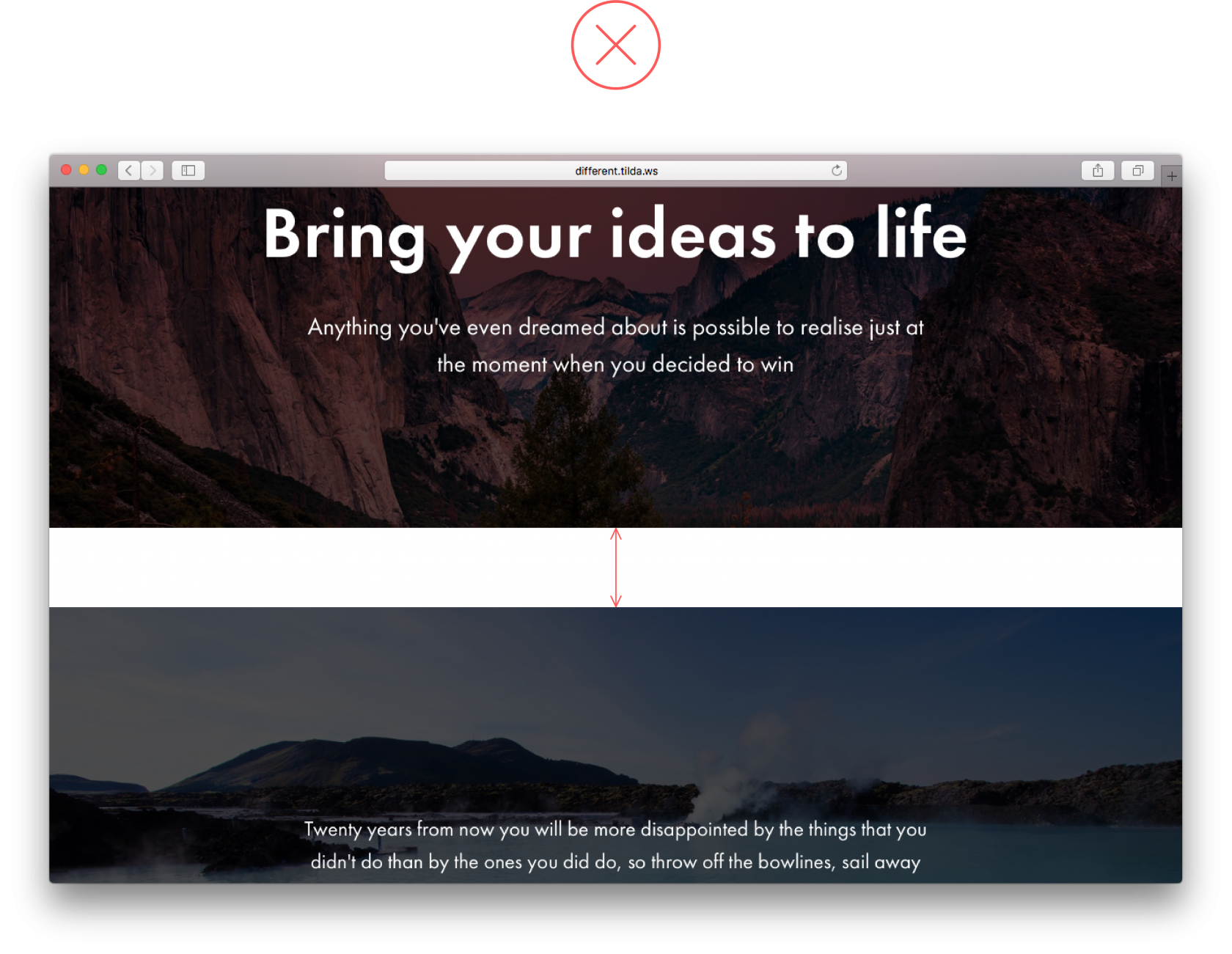 An empty space between full-screen images make no sense and doesn’t look good An empty space between full-screen images make no sense and doesn’t look good |
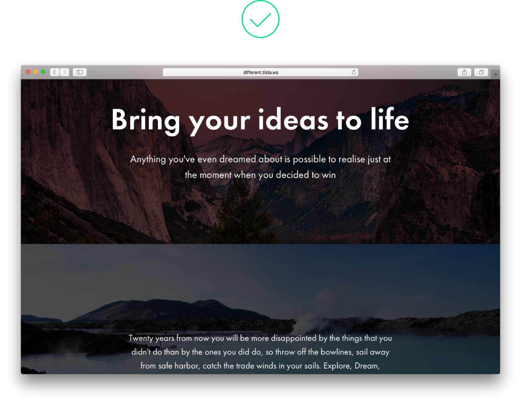 There is a harmonious flow between images in this example There is a harmonious flow between images in this example |
11. Too many design accents being used
Design accents (such as boldface here) work well when there are few of them. Put in too many, and this will get in the way of reading the page. 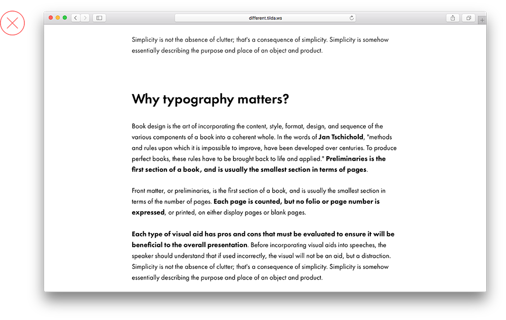 |
|
Many words are marked in bold, so the text copy appears broken
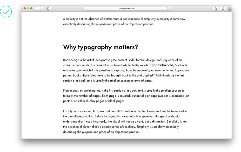
A few marked words draw attention to themselves, and don’t interfere with the rest of the text
12. Too many typography styles
Design should not interfere with readability. The fewer typography styles there are, the more important design elements are visible. It’s enough to emphasize headlines and subheads, and use contrast for key phrases.
 This text has too many typographic devices. They are distracting to the reader This text has too many typographic devices. They are distracting to the reader |
 Very few typography styles, emphasis is clear, and text hierarchy is observed Very few typography styles, emphasis is clear, and text hierarchy is observed |
13. Centering text in a long article
Centering is usually applied to headlines and block quotes to distinguish them from the rest of the text. A centered long text is difficult to read.
 A centered text looks messy, plus it’s hard to read A centered text looks messy, plus it’s hard to read |
 A text aligned to the left is easy on the eye A text aligned to the left is easy on the eye |
14. Headline appears too close to the image
A headline is an individual design element. It should not sit too close to an image that follows. For a winning combination, set padding at no less than 60 px, and add a subhead – it will unfold the contents of the page and place the right emphasis where you need it.
 The headline sits too close to the image, there is no breathing room on this page The headline sits too close to the image, there is no breathing room on this page |
 Here the headline is separated from the image by a subhead, and it relates to the entire section, not just the image Here the headline is separated from the image by a subhead, and it relates to the entire section, not just the image |
15. Using italics when they are not needed
Italics are used to highlight a word or a short phrase within a text. It is not as immediately noticeable as bold type but it does allow you to make an emphasis where you need it.
Don’t write everything in italics (body copy, headlines). And if sans-serif fonts are used in text copy, avoid italics altogether. 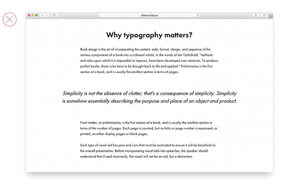
The phrase stands out already thanks to the font size and padding, so the italics are not really needed here
Italics are in the right place, adding the right amount of emphasis
16. Blocks appear out of place relative to the centre of the page and each other
You can spot this error easily yourself if you take a small break after editing your page (changing font size, alignments or indentation) and taking a look at what’s on it.
 In this example, the headline is shifted to the left, and text copy to the right In this example, the headline is shifted to the left, and text copy to the right |
 All text elements are in harmony with each other All text elements are in harmony with each other |
Written by: Ira Smirnova, Masha Belaya, Julia Zass (via Tilda blog)
Design and layout: Julia Zass
Posted by: CueCamp


Post a comment