The new Obamacare website, HealthCare.gov, has been getting much media attention over the past few weeks due to flaws in the user experience after its launch. Heavy traffic, network problems, and design flaws have hampered users from shopping for health insurance. Many agree that the new website presents a fragmented user-experience, which was not tested properly before its launch.
Many usability problems are quickly being addressed and fixed: for example, a recent post by Nielsen-Norman Group discussed the primary call to action (apply button) displayed below the fold, requiring users with typical screens to have to scroll down to find the apply button. As can be seen in the above screenshot, this problem has been addressed. However, the overall user-experience of shopping for health insurance is still flawed – with basic pricing information being difficult to find, and changing information as users go through the registration process. The new HealthCare.gov website highlights the difference between usability and user-experience: while usability could use improvement, the overall experience of the website is quite complicated, hindering users from shopping for insurance coverage.

The HealthCare.gov homepage has a well-designed wireframe, with clear labels and an easy to understand navigation structure. There are clear calls to action, encouraging users to apply for coverage (the ‘Apply Online’ and ‘Apply by Phone’ buttons). For users looking to explore coverage options before applying, the ‘See Plans Now’ button, circled above, helps users to see plan options before registering. However, once plan options come up, more information to discriminate amongst plans is not available:
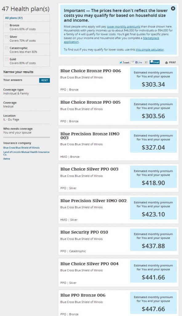
While the site states repeatedly that costs vary depending on factors such as income level, more information on the plans could be made available under each option. As shown above, 47 options were available, with little to discriminate between plans other than price.
Application Process
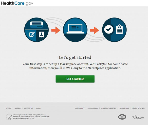
The initial screen for applying looks like the following:
While the above screen is simple, with a clear call to action (clicking ‘Get Started’), the icons representing the application process are not clear. While it appears that a three step process is involved, the icons do not convey meaning to the user as to what is involved. Following, users are asked to create an account:
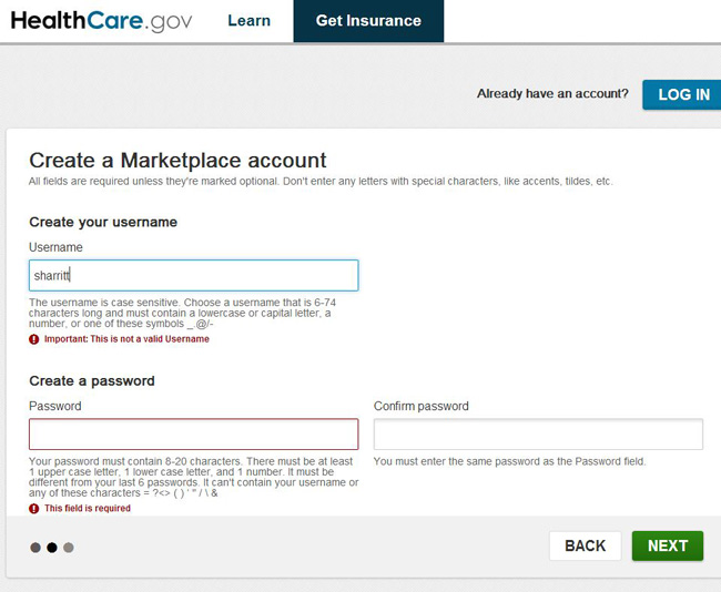
As shown, the account creation screen is simple (creating a username and password), but the security process complicates things. Instructions on creating a username and password require special characters for increased security, which can frustrate the registration process. Password characters are hidden as dots, making it more difficult for users to see what they are typing for a password. The process indicator (lower-left dots) are not clear at communicating where exactly the user is at while registering, either.
Over-Blown Security Wrecks User Experience
We had a test user run through the application process on HealthCare.gov, and their experience highlights problems with the website’s heightened security requirements, as well as delays from the site being unavailable or too slow:
The entire application process took about 55 minutes, longer than what I would anticipate for filling out a simple application. Why? I was asked many security questions to ensure my identity. I was first asked to make an account, which required me to answer 10 security questions. It was scary to know the amount of information they knew about me. One of the questions was, ” What was the name of the dog that you bought pet insurance for in 2010?” How would they know that? Other questions asked about information on my taxes and credit report.
Once my identity was checked I then watched the wheel of death spin and spin with a message saying that they would email me a link in order to move forward. I went to my email where I waited for about 30 minutes before I received my special link.
Once I clicked on the link I was brought back to the website and asked to login. After logging in I was then asked several more security questions in order to ensure my identity yet again. This time I was asked to set up security questions. Normally on a website security questions that you set up are suggested to you as they were here. However the types of questions set up were much more detailed then I would have liked. As an example one question was,” What is your parents current mailing address?” Another question I could set up was,” What is the VIN number to your car?” I am sure if I ever could not log into my account and the VIN question came up I would not be able to remember the answer.
I then was able to fill out the application, which took me through my personal information, tax history, current income level, and what I expect my future income to be. The application process was then completed, so I had thought. I was then asked to review my application.
During the reviewing process you were supposed to be allowed to correct any information on the application. I made several attempts to change my address. I would click on the EDIT button and it would take me to a different section of the application. I spent about 5 minutes trying the edit process but never managed to change my address. I would be brought to a different section of the application and I would have to continue from that point on filling out the entire application again.
Security is paramount on a government website handling personal information and health records; however, the amount of verification seems to hurt the user experience. As discussed, users must create an account to obtain accurate pricing information and to shop health insurance plans. Users can see a list of plan names for their area with typical pricing, but pricing is inaccurate until an application has been filled out (based upon income and other factors).
Our test user above was emailed after the application was filed, and told that they had to wait to see coverage plans until further investigation could be completed. Our user expected to be ‘rewarded’ with useful information after completing the long application process. The early stages of application on HealthCare.gov look simple, and encourage users to begin an application; however, the reality is a long process with difficulties that waste users’ time and a delayed gratification of shopping for coverage.
Technical Problems and Error Messages
As stated in the news, HealthCare.gov frequently stalled or the system went down for our test users. Below is an example, with a ridiculous ‘reference ID’ code to phone in to customer service:
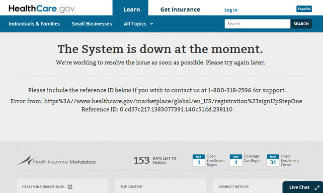
While surprising for such an important website launch, heavy traffic from initial use might be partially to blame, as is the lack of testing before the site was live. From a usability standpoint, improving user workflows through the site could also yield performance increases, reducing demand on precious system resources that are being shared by so many users seeking coverage before the mandatory deadline.
We cannot imagine the costs being incurred by the number of employees required to handle the phone calls and customer service. As the saying goes, ‘an ounce of prevention is worth a pound of cure‘, which certainly applies to usability research and careful planning of a website this large and important.
If you have used HealthCare.gov, please tell us about your experience by leaving a comment below.
Written & Posted by: CueCamp
